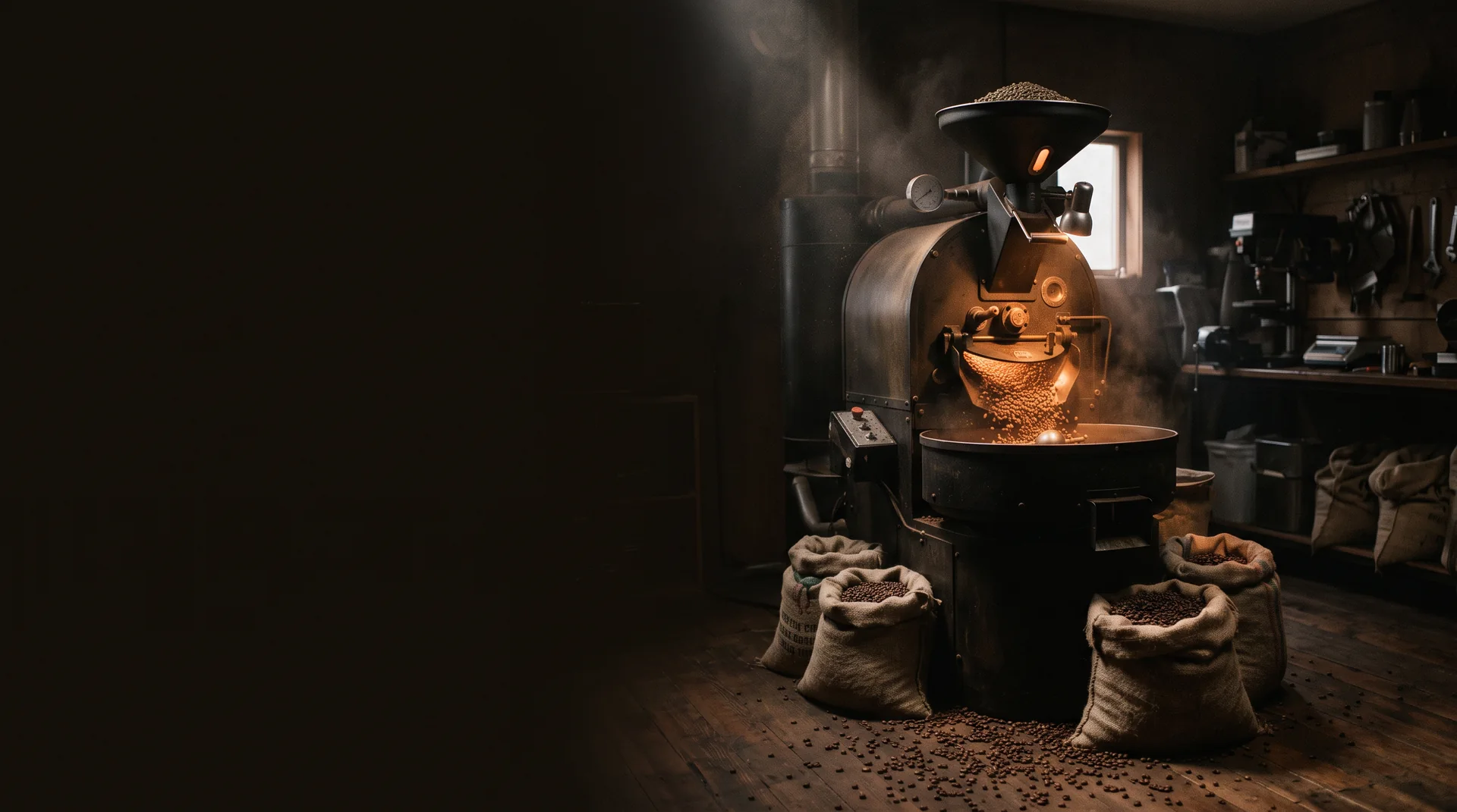
Kettle & Crow — dark roastery at dawn, drum roaster glowing amber, coffee sacks on the floor
Brand identity · Packaging · E-commerce · 2026

Kettle
& Crow

Slow coffee. Richer mornings.
Scroll
ClientKettle & Crow Coffee Roasters
SectorSmall-batch coffee
ScopeIdentity, packaging, website
Year2026
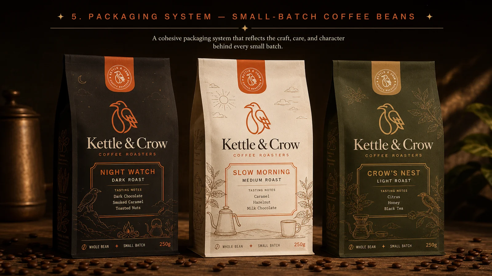
Kettle & Crow packaging system — three coffee bags in espresso, cream and olive with illustrated labels
01 — THE BRIEF

Great beans, invisible on the shelf

Kettle & Crow roast by hand in small batches — but their bags looked like everyone else's. In a category crowded with kraft paper and safe serif type, quality alone wasn't enough to get picked up.

02 — THE IDEA

Slow, on purpose

Not a café brand — a roastery. We built the identity around craft and patience: a hand-drawn crow that carries a coffee bean in its line work, warm ember orange against deep espresso, and illustration that rewards a second look.

03 — THE SYSTEM

Three roasts, three worlds

Night Watch, Slow Morning and Crow's Nest each get their own colour and their own illustrated scene — dark, dawn, and daylight. One shelf, three moods, unmistakably one family.
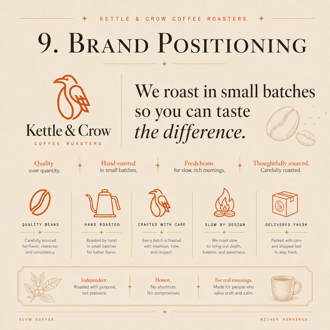
We roast in small batches so you can taste the difference.

Brand positioning
01

The mark

A single-line crow, drawn from a coffee bean
Kettle & Crow primary logo — line-art crow above serif wordmark
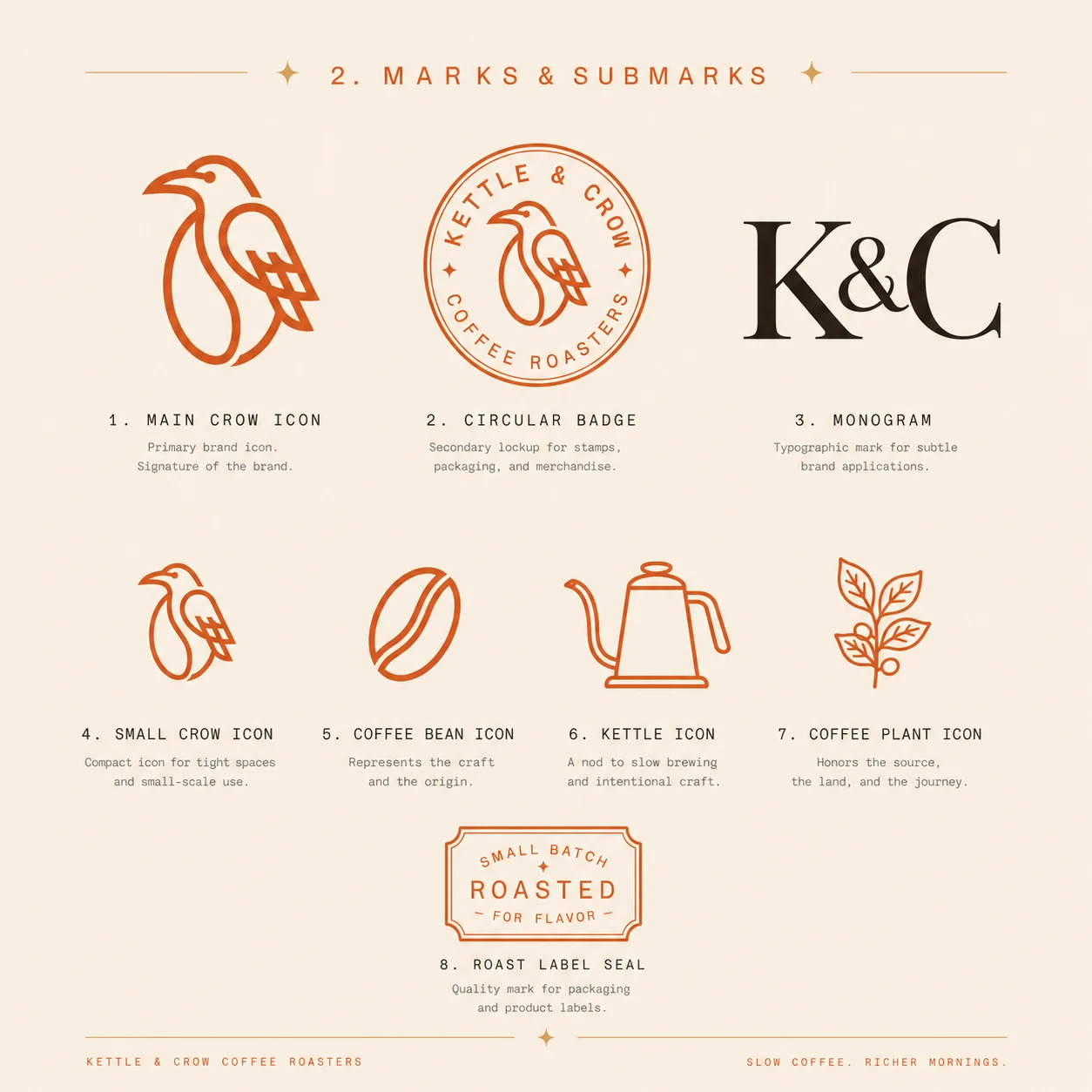
Kettle & Crow marks and submarks — crow icon, circular badge, K&C monogram and icon set
02

Colour & type

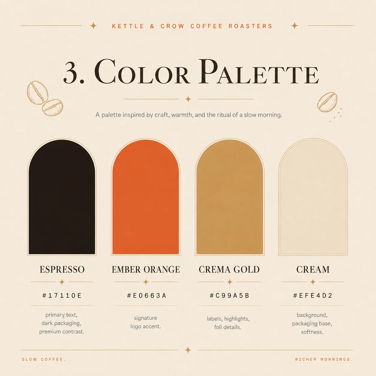
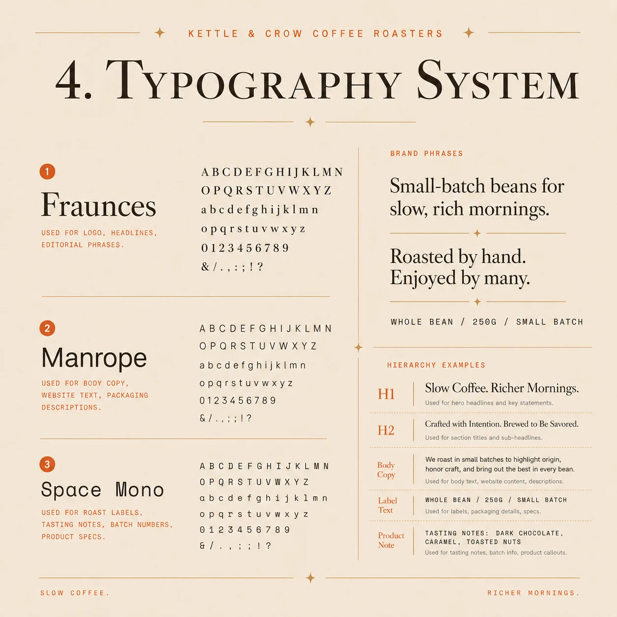
Espresso, ember, crema, cream — and nothing else
Kettle & Crow colour palette — espresso, ember orange, crema gold and cream
Kettle & Crow typography system — Fraunces, Manrope and Space Mono hierarchy
03

Applications

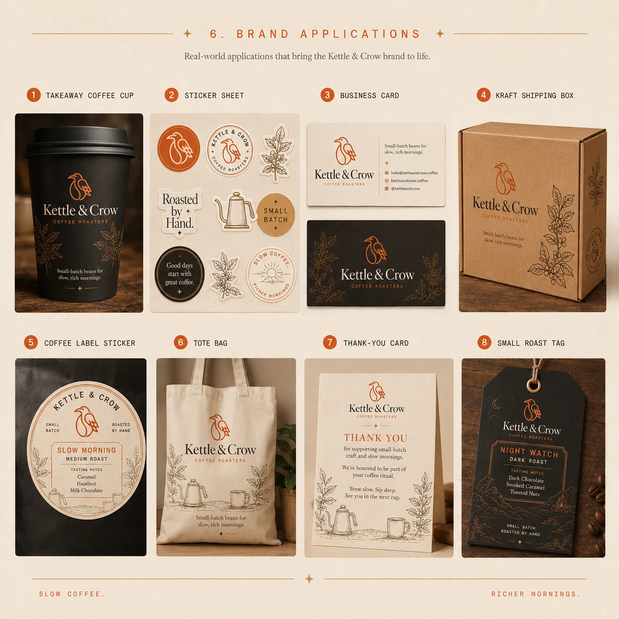
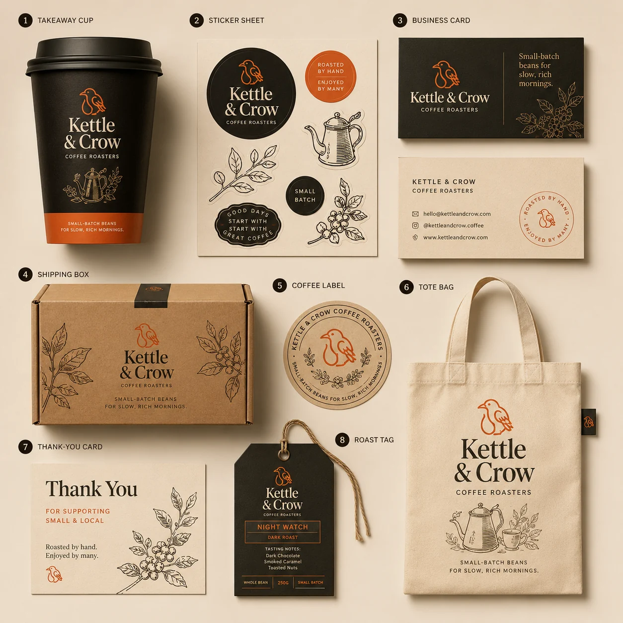
Cups, cards, boxes, totes — the brand off the page
Kettle & Crow brand applications — takeaway cup, sticker sheet, business card, shipping box, tote and roast tag
Kettle & Crow stationery flat lay — cup, stickers, cards, box, label and tote bag
04

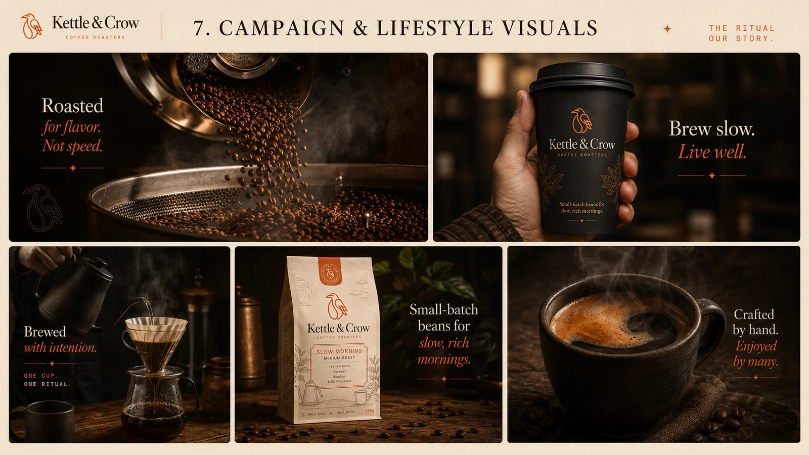
Campaign

Roasted for flavour. Not speed.
Kettle & Crow campaign and lifestyle visuals — roasting drum, pour-over, takeaway cup and packaging
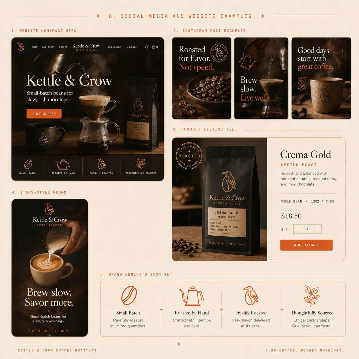
Kettle & Crow social media and website examples — homepage hero, Instagram posts and product listing

The brand, built.

We didn't stop at the guidelines. The Kettle & Crow storefront was designed and coded — a fast, mobile-first one-page site with the full roast range and an online shop.

View the live site →
05

Positioning

Why anyone should care
Kettle & Crow brand positioning — quality over quantity, hand-roasted, thoughtfully sourced
06

The outcome

A roastery that finally looks like it tastes. The system runs from the shelf to the shipping box to the shop — one crow, four colours, and illustration that makes a small brand feel like a long-standing one. Built to be picked up, and built to be remembered.

Logo, badge & monogram 3 marks
Icon & illustration set 8 icons
Packaging system 3 roasts
Stationery & merch 8 items
Campaign visuals Full set
Website & storefront Built & live
Next project

Fico & Fern

View →
Close ✕