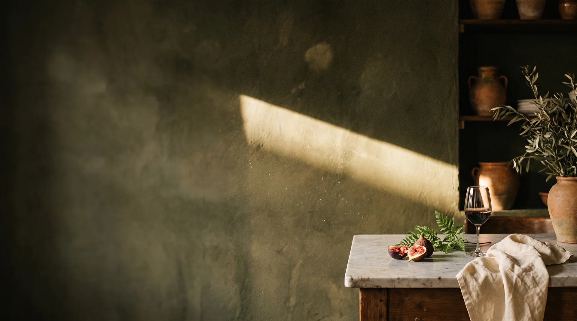
Fico & Fern — olive plaster wall, marble table with figs, fern and red wine in raking afternoon light
Brand identity · Hospitality · Illustration · 2026

Fico &
Fern

Rustic Italian cooking with a gardener's soul.
Scroll
ClientFico & Fern Trattoria
SectorNeighbourhood restaurant
ScopeIdentity, illustration, print, digital
Year2026
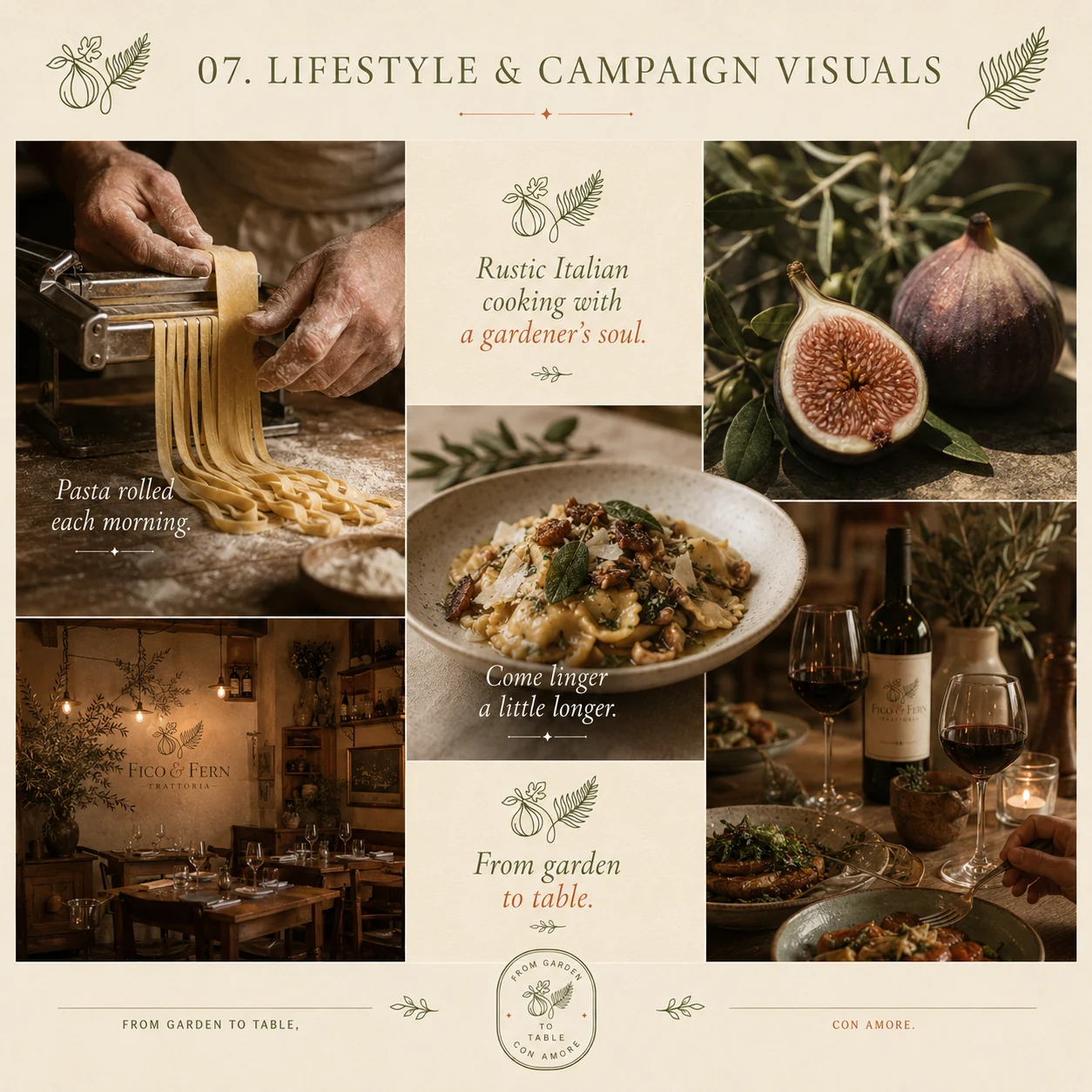
Fico & Fern lifestyle and campaign visuals — fresh pasta, figs, trattoria interior and a table set for dinner
01 — THE BRIEF

Another red-checked cliché

Italian restaurants inherit the same tired visual language — checked cloth, tomato red, a script font pretending to be handwriting. Fico & Fern cook seasonally, roll their pasta each morning, and grow their own herbs. Nothing about their branding said so.

02 — THE IDEA

Grown, not designed

We took the restaurant back to the garden. A fig and a fern — fruit and leaf, indulgence and green — drawn as one continuous botanical line. Olive and terracotta instead of red and white. The result reads Italian without ever shouting it.

03 — THE SYSTEM

A botanical language

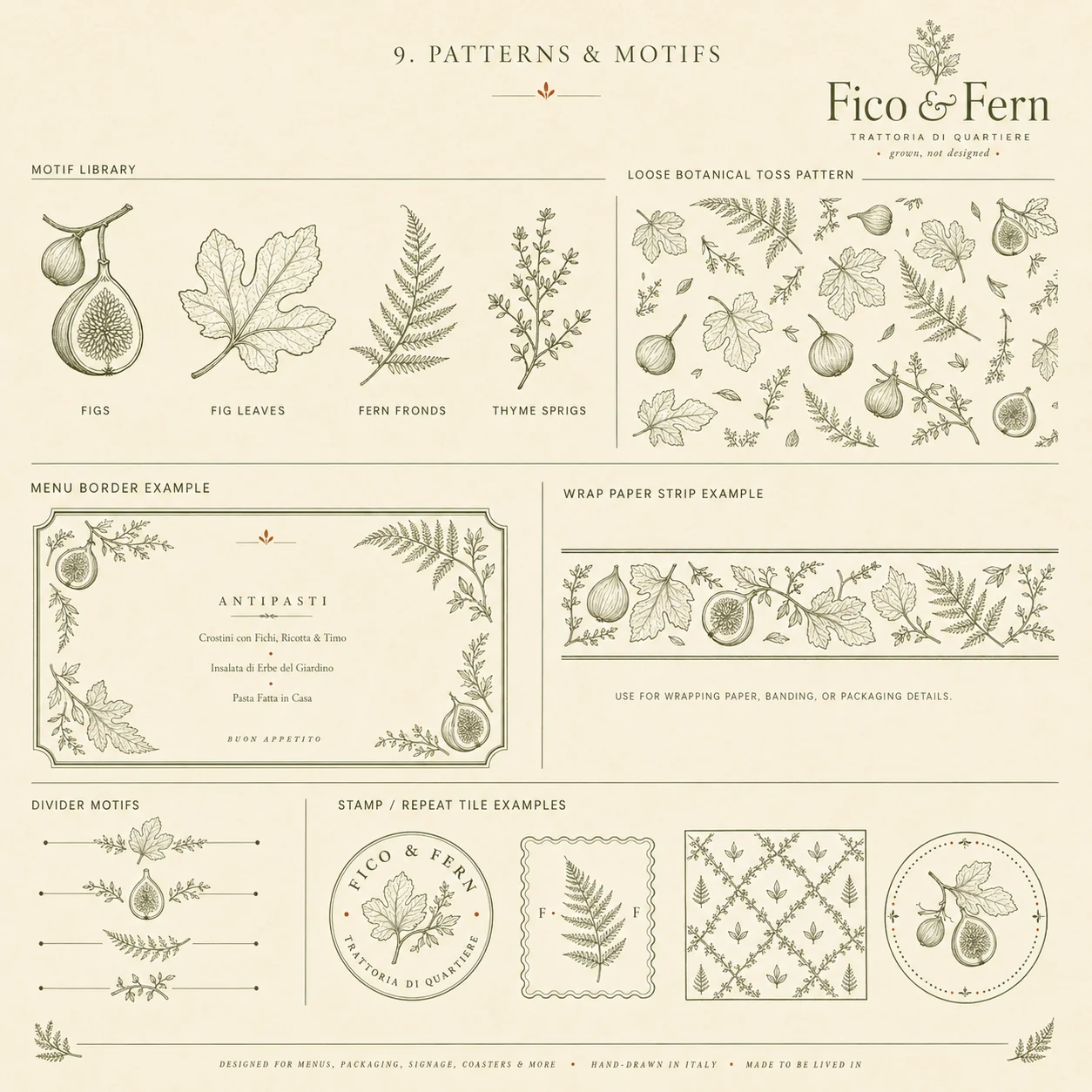
Rather than one logo, we drew a library — figs, fig leaves, fern fronds, thyme sprigs — that becomes borders, patterns, wrapping paper, seals and menu frames. Endlessly reusable, always recognisable, never repeated the same way twice.
From garden to table, con amore.

Brand seal
01

The mark

A fig and a fern, drawn in one line
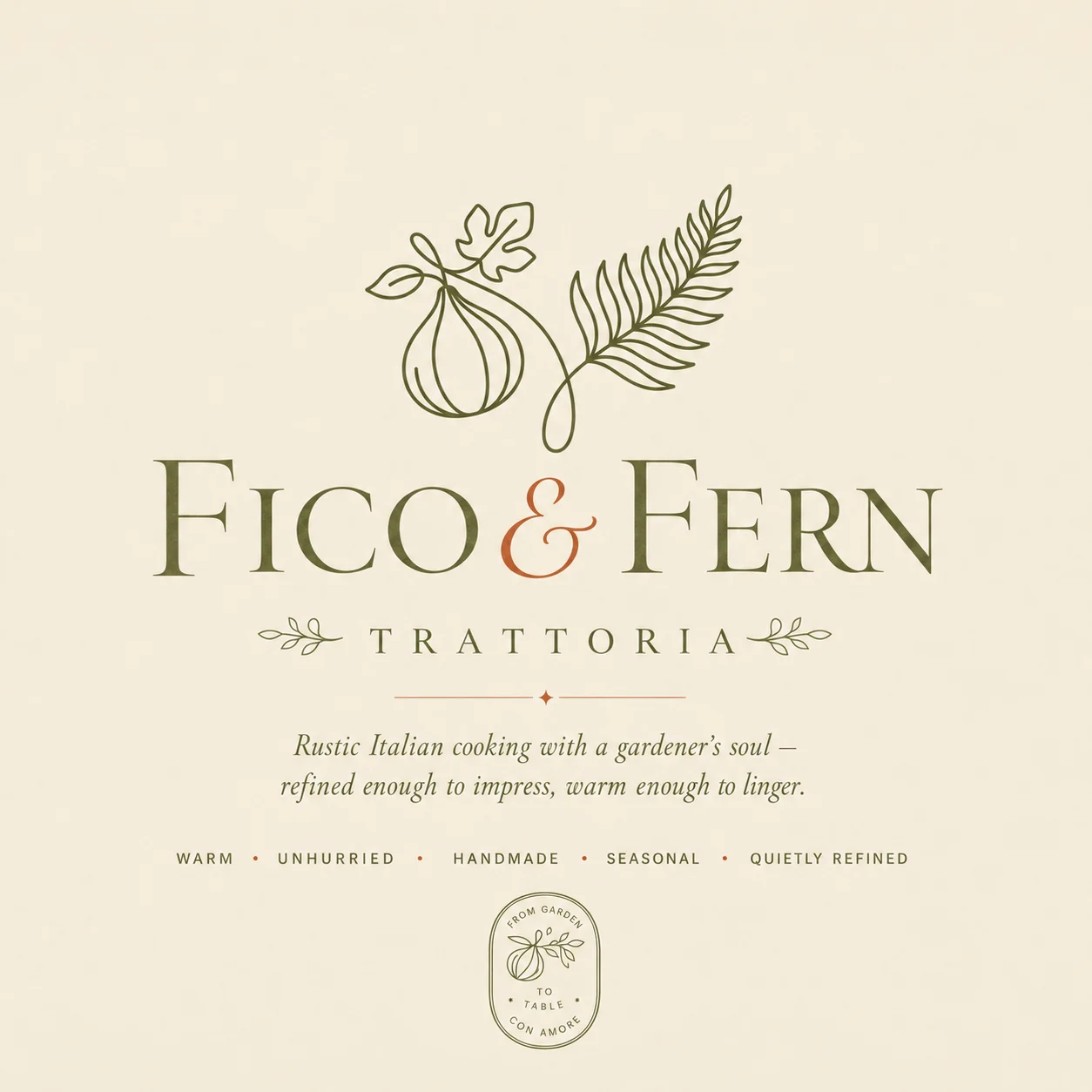
Fico & Fern primary logo — botanical fig-and-fern mark above a serif wordmark with terracotta ampersand
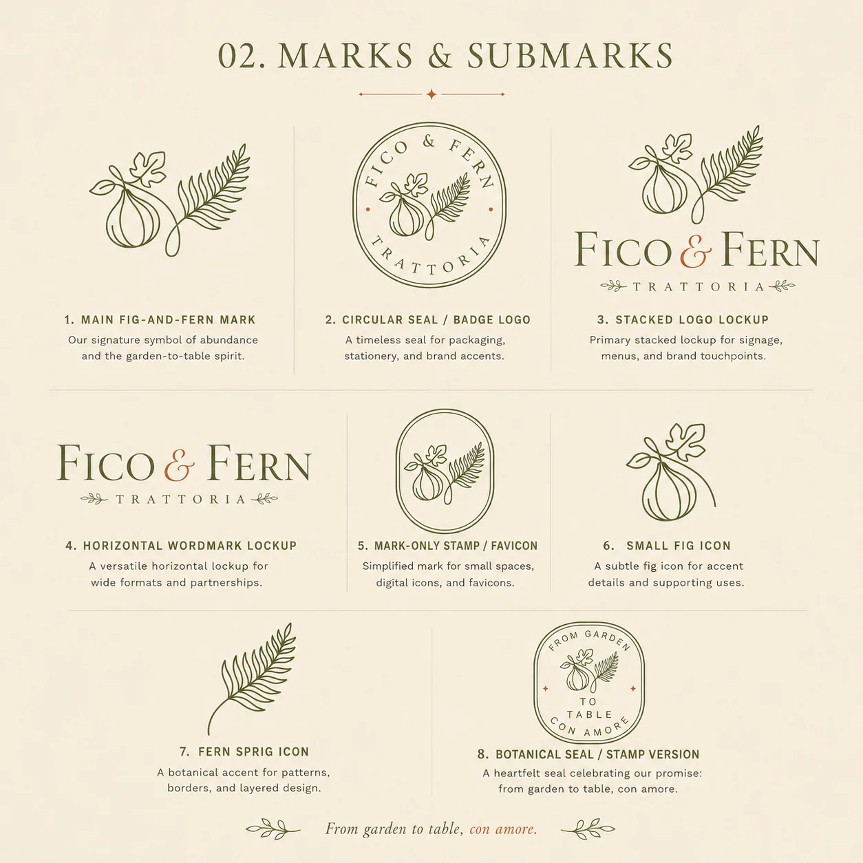
Fico & Fern marks and submarks — circular seal, stacked lockup, favicon stamp and botanical icons
02

Colour & type

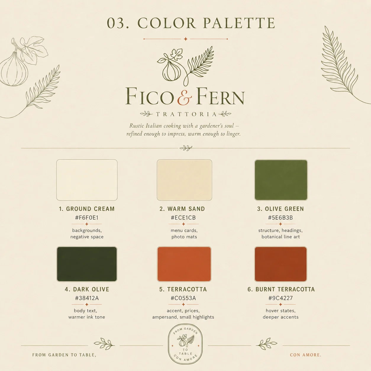
Olive, terracotta, cream — the garden, not the flag
Fico & Fern colour palette — ground cream, warm sand, olive green, dark olive and terracotta
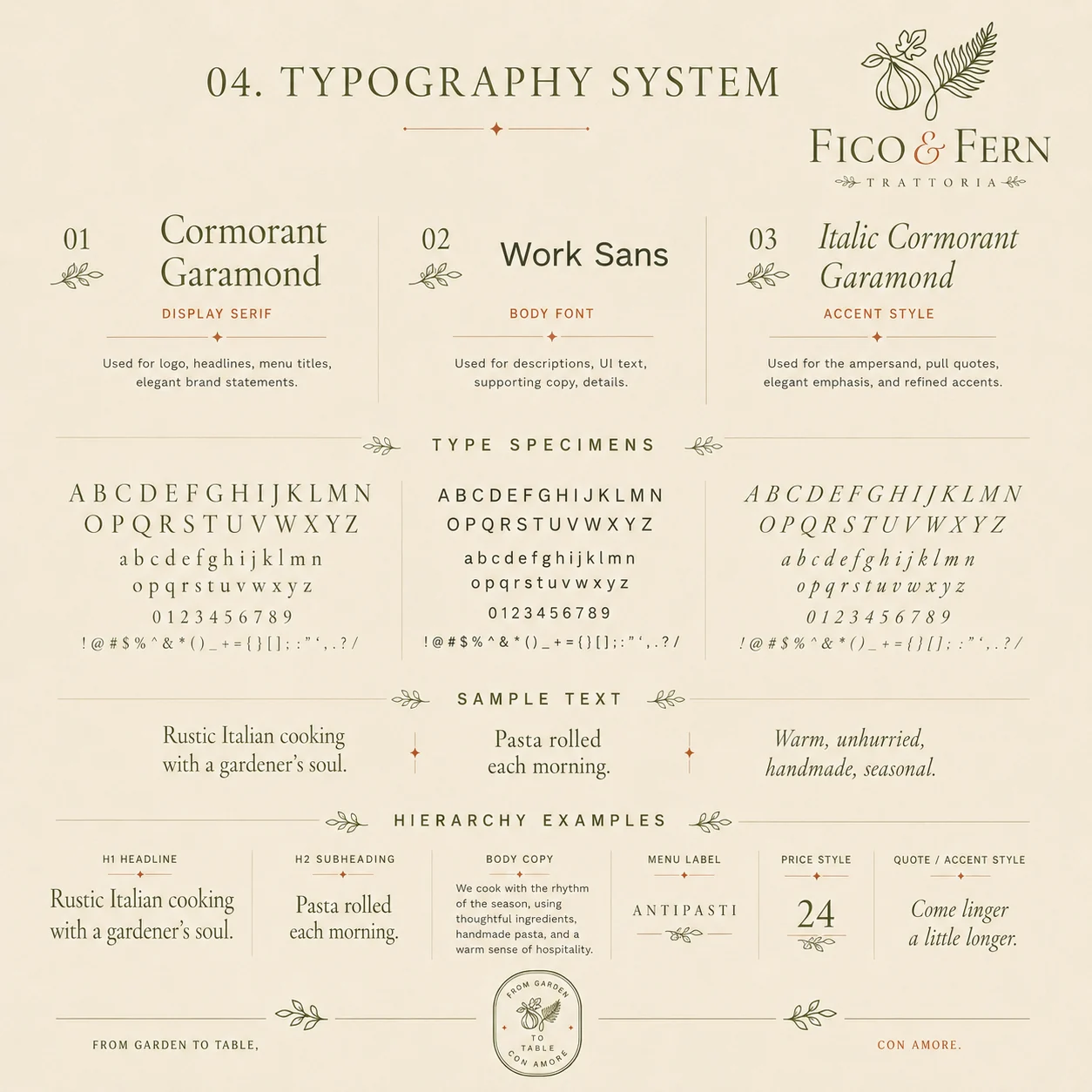
Fico & Fern typography system — Cormorant Garamond and Work Sans with hierarchy examples
03

Patterns & motifs

One drawn library, endless applications
Fico & Fern patterns and motifs — botanical motif library, toss pattern, menu borders and repeat tiles
04

In print

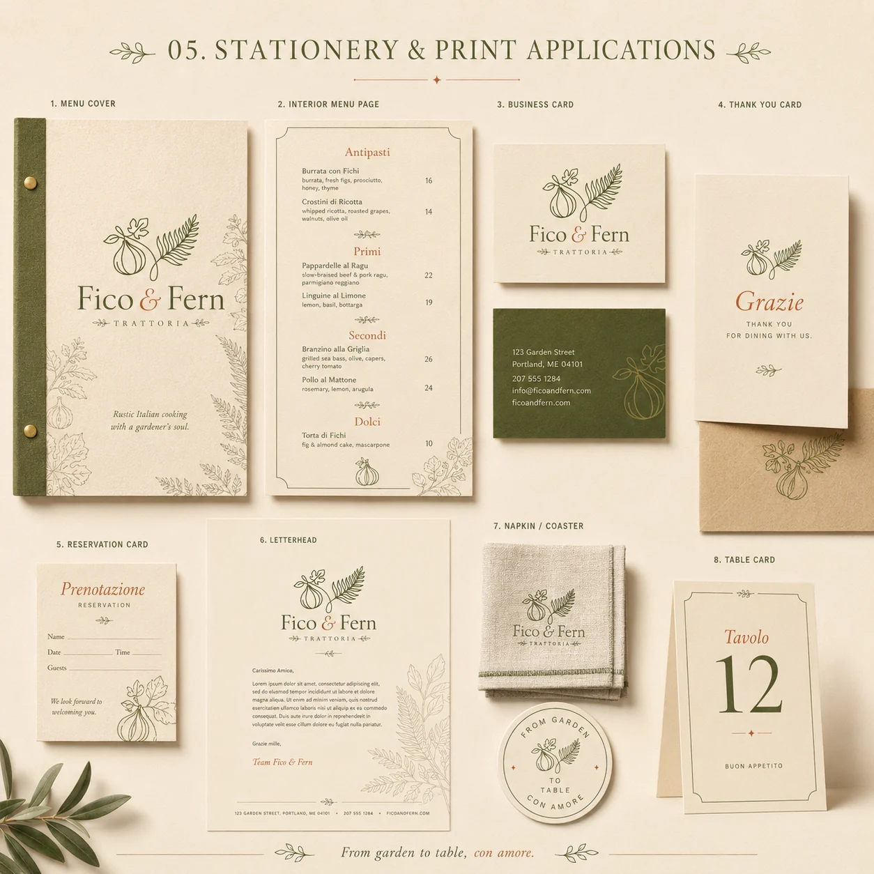
Menus, cards, packaging and takeaway
Fico & Fern stationery and print — menu cover, interior menu, business cards, letterhead and table cards
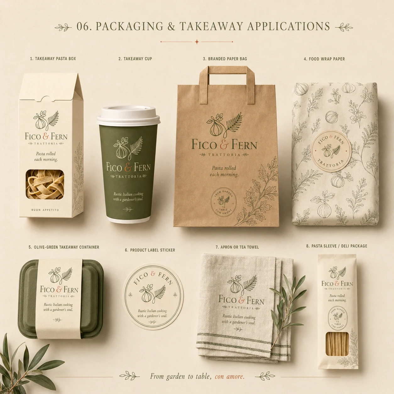
Fico & Fern packaging and takeaway — pasta box, cup, paper bag, wrap paper, apron and deli sleeve
05

Digital

Reservation-led, warm, unhurried
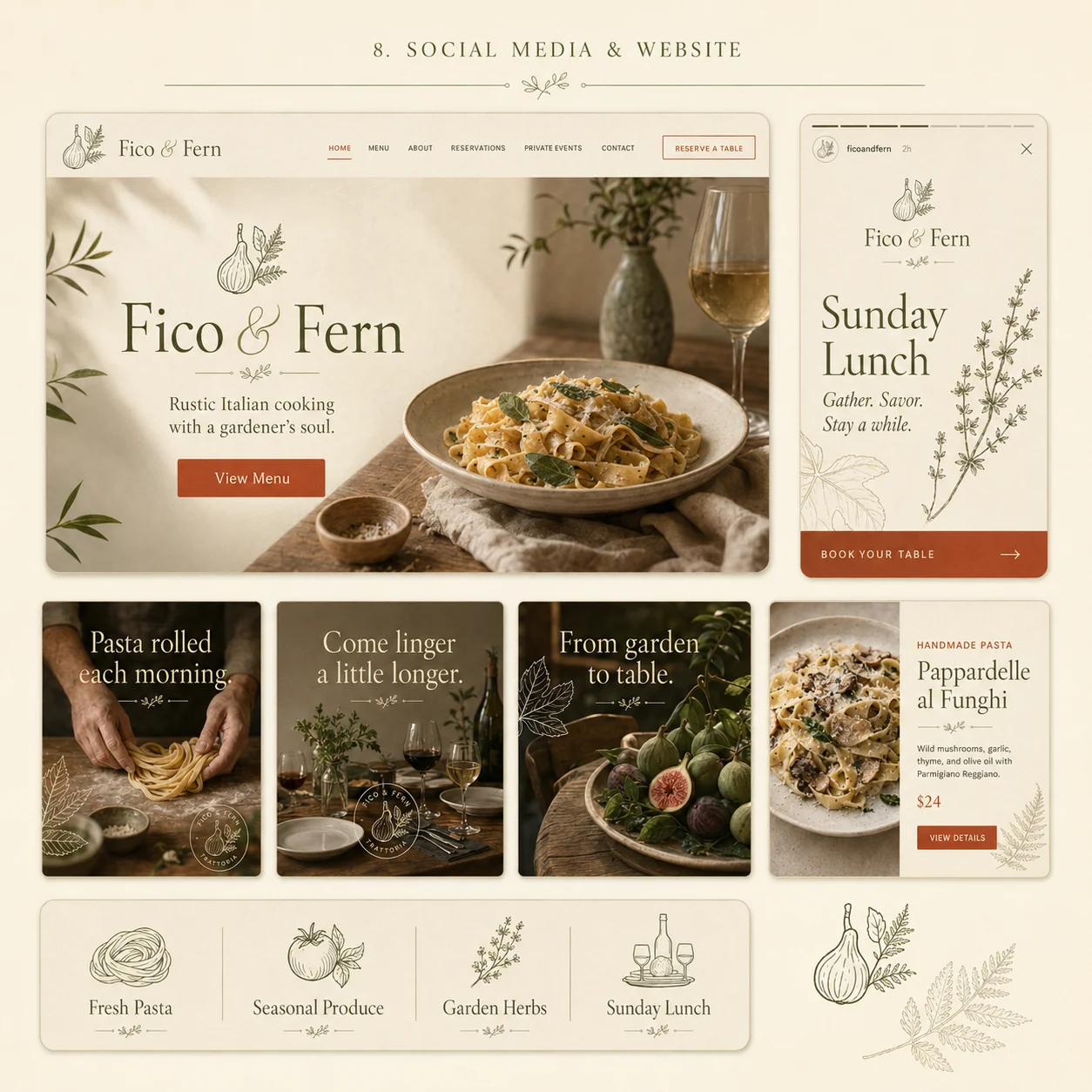
Fico & Fern website and social media — homepage hero, Instagram story, campaign tiles and menu cards
06

The outcome

A trattoria that finally looks the way it cooks — warm, unhurried, handmade. The botanical system means every future menu, poster and package already knows what to do, without a designer in the room. Refined enough to impress. Warm enough to linger.

Logo, seal & lockups 8 marks
Botanical illustration Full library
Menus & stationery 8 items
Packaging & takeaway 8 items
Patterns & motifs Repeat system
Website & social Digital kit
Next project

Sönder

View →
Close ✕