
Sönder — frosted glass skincare bottle and a smooth pebble on pale stone in cool Nordic mist
Brand identity · Packaging · Skincare · 2026

Sönder

Care, unhurried.
Scroll
ClientSönder
SectorNordic skincare & bath
ScopeIdentity, packaging, e-commerce
Year2026
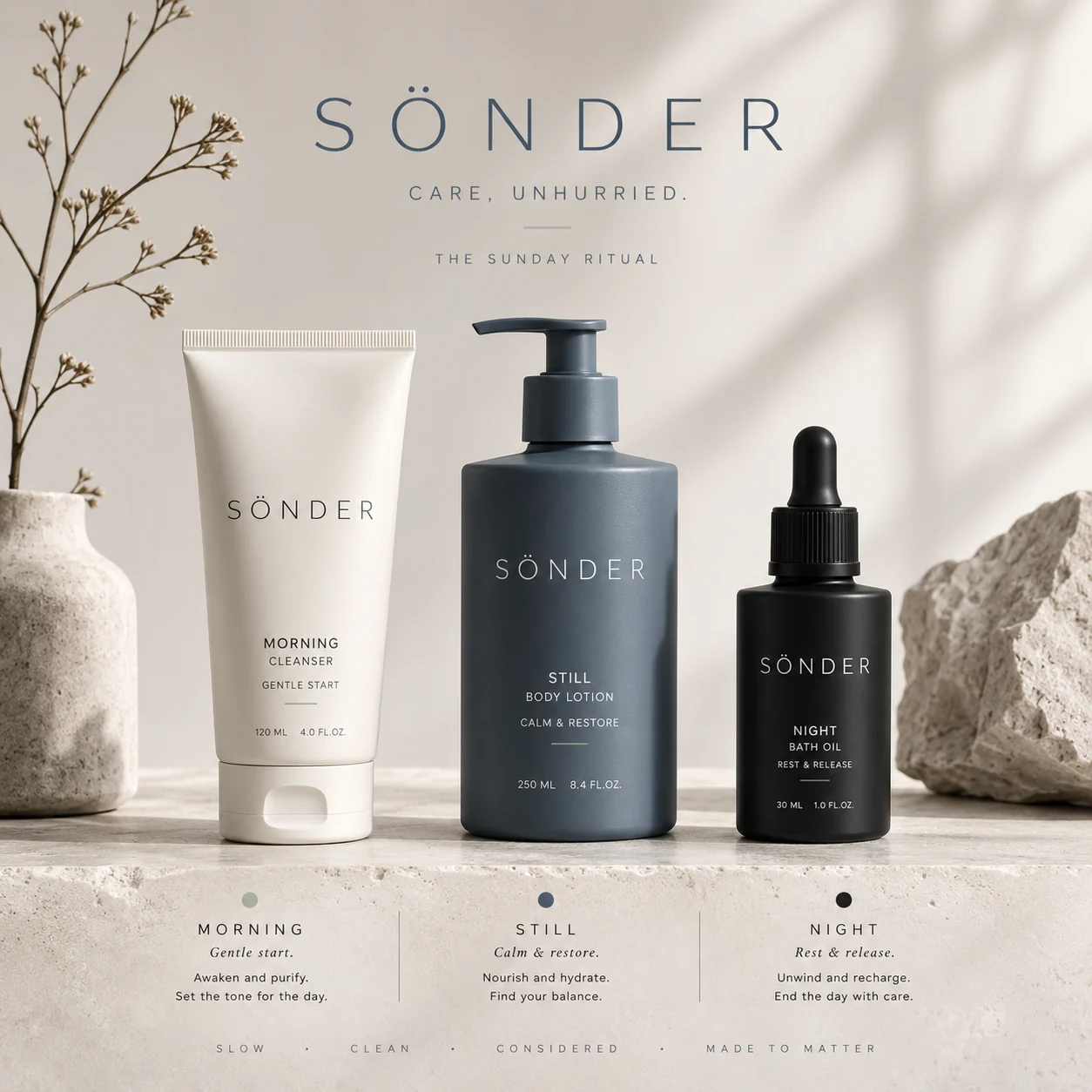
Sönder product line — cleanser, body lotion and bath oil in bone, slate and ink on stone
01 — THE BRIEF

A shelf that shouts

Skincare has become loud — neon gradients, wellness buzzwords, packaging competing for attention. Sönder wanted the opposite: a brand that a customer would keep on the counter rather than hide in a cupboard.

02 — THE IDEA

Say less

No icon. No illustration. A single light wordmark with wide tracking, and space around it. In a category that screams, silence is the loudest move — and restraint reads as expensive without ever claiming to be.

03 — THE SYSTEM

Morning. Still. Night.

Three products, three moments, three tones — bone, slate, ink. The palette is the navigation: you know which bottle you're reaching for before you read a word. One ritual, from waking to rest.
Made for quiet moments.

The Sunday Ritual
01

The mark

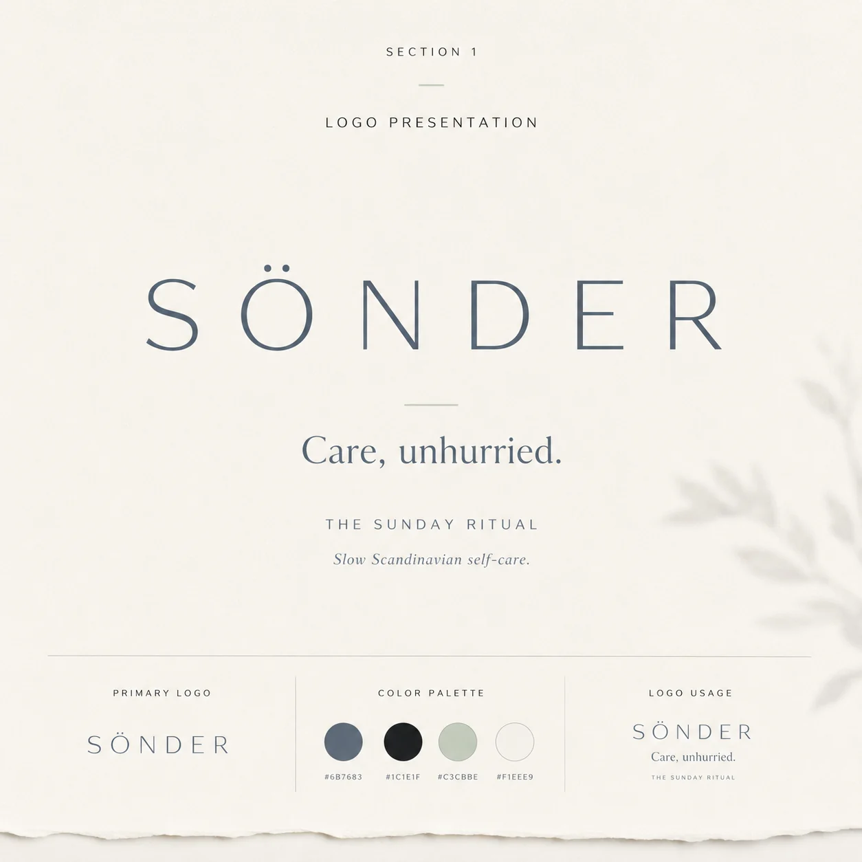
A wordmark, and the confidence to stop there
Sönder logo presentation — light wide-tracked wordmark with the tagline Care, unhurried
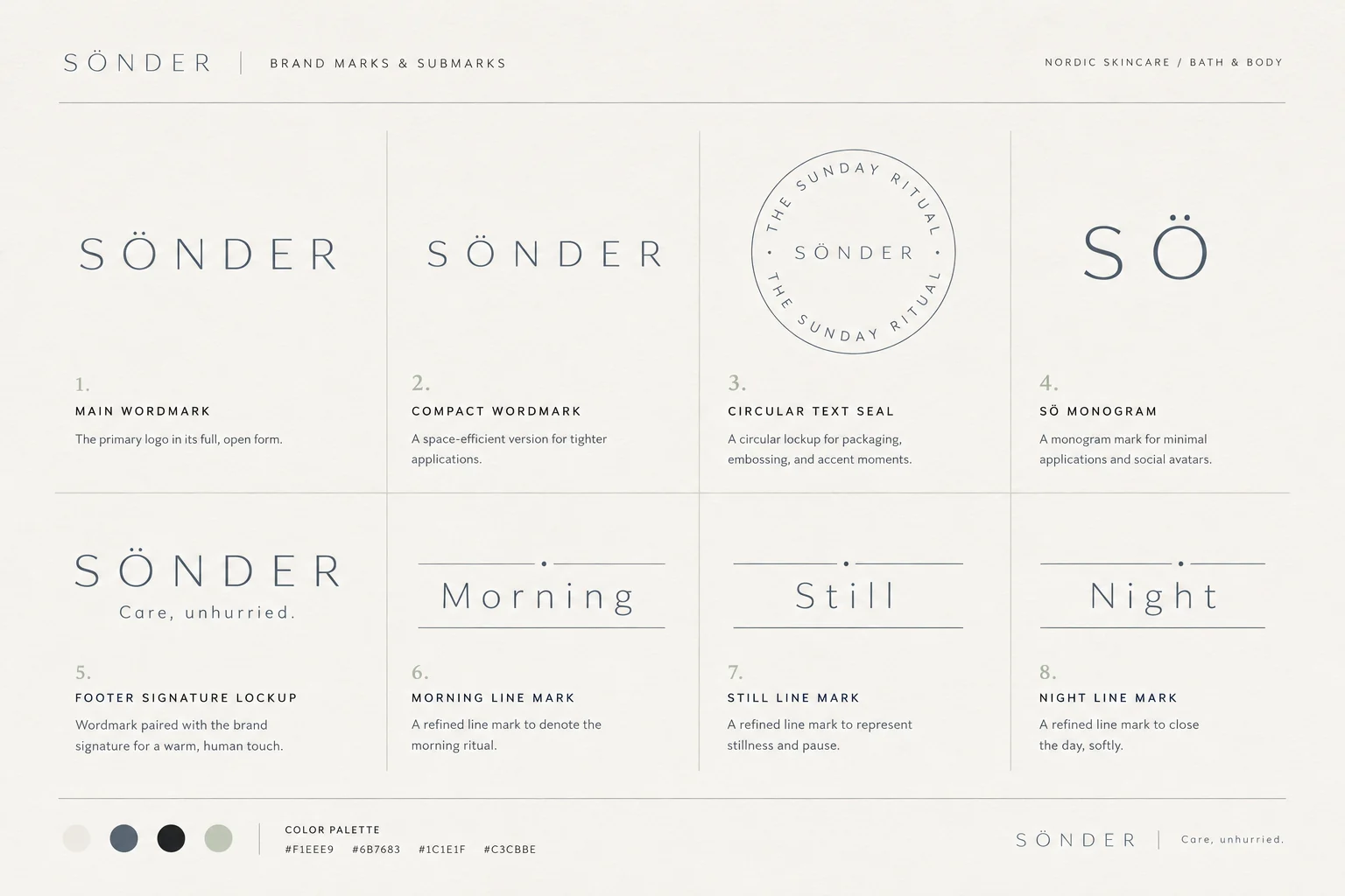
Sönder marks and submarks — compact wordmark, circular seal, SÖ monogram and ritual line marks
02

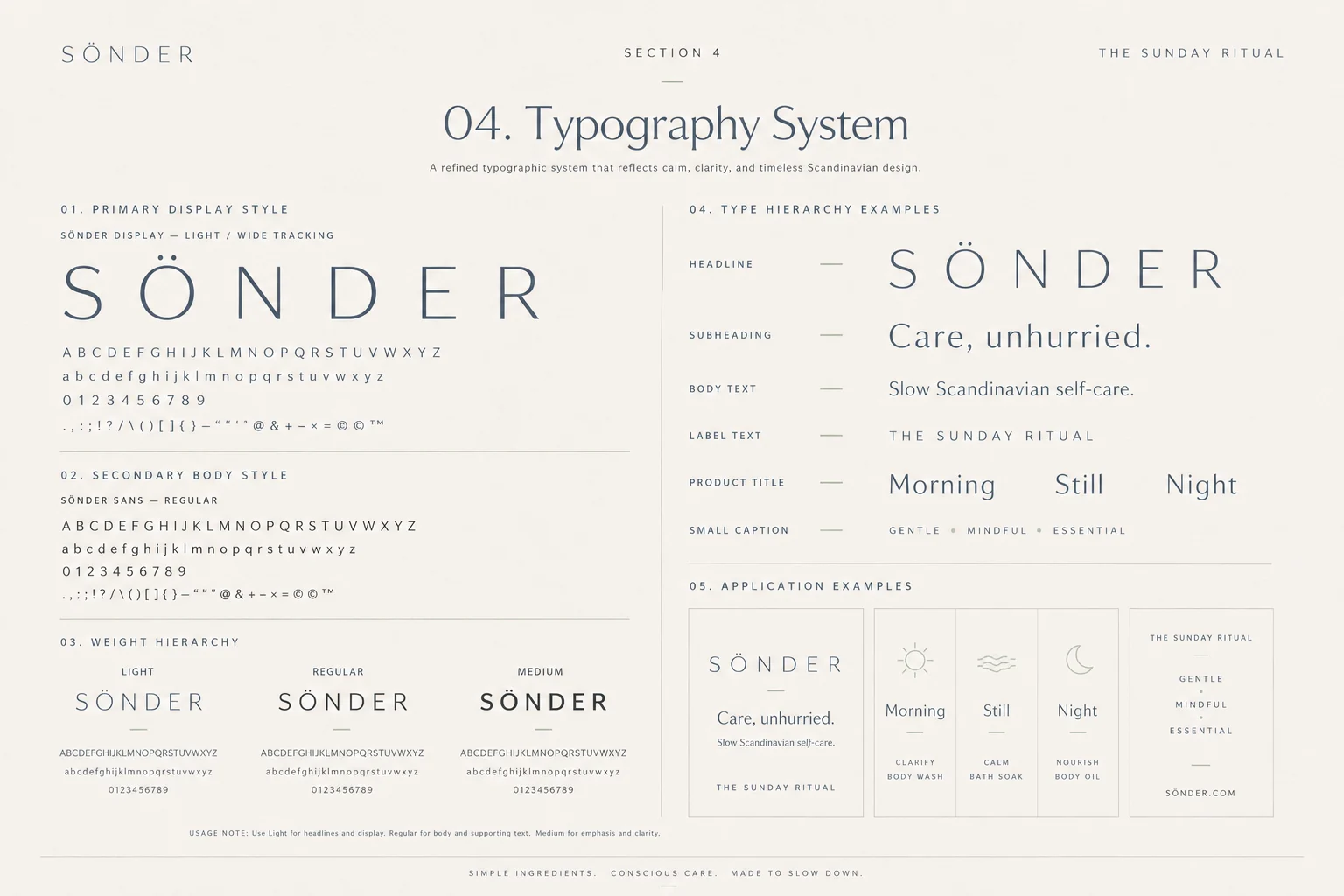
Colour & type

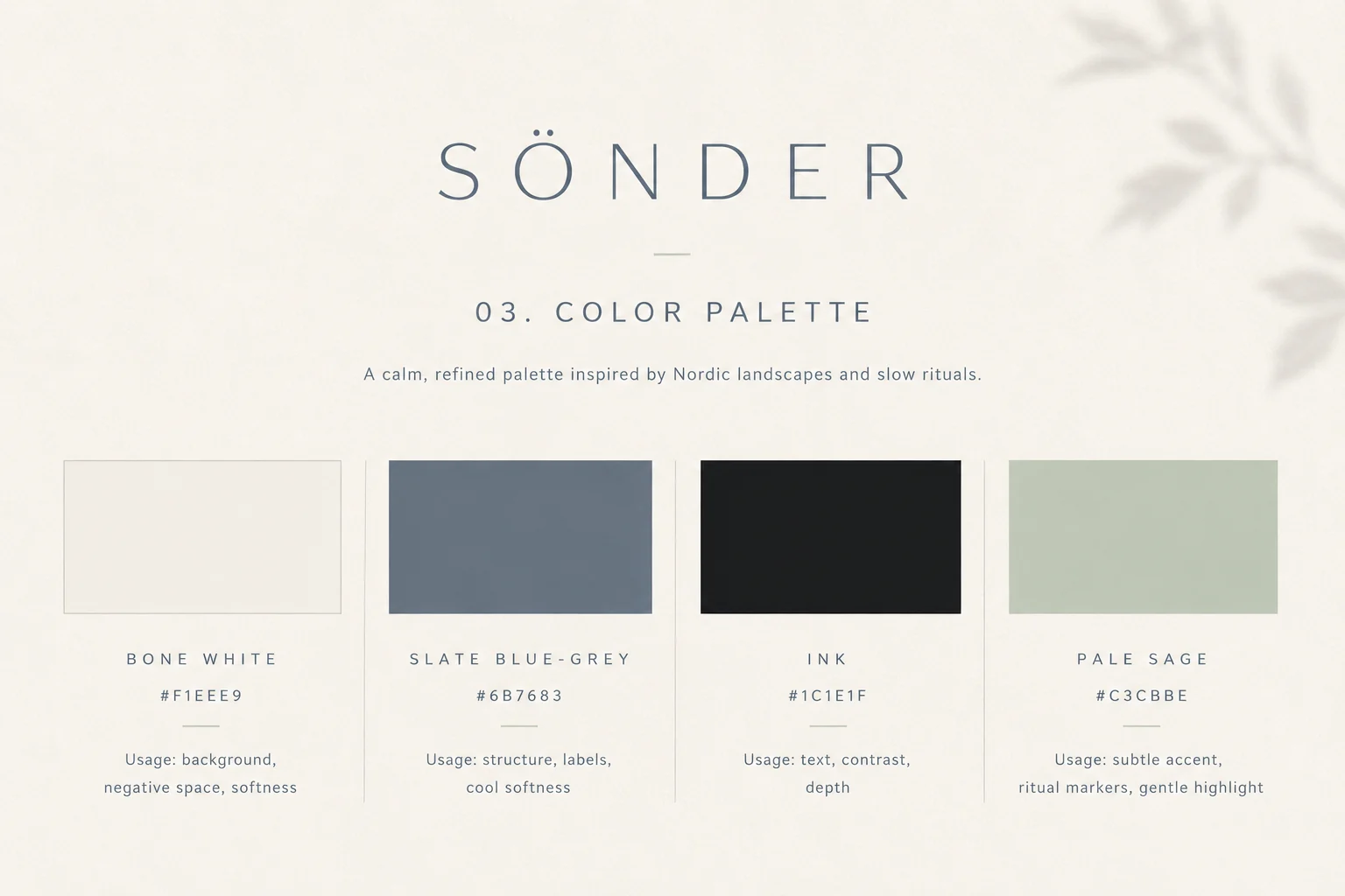
Bone, slate, ink, sage — a Nordic landscape
Sönder colour palette — bone white, slate blue-grey, ink and pale sage
Sönder typography system — light wide-tracked display with weight hierarchy and application examples
03

The product line

Colour as navigation — light to dark, day to night
Sönder product line — Morning cleanser, Still body lotion and Night bath oil
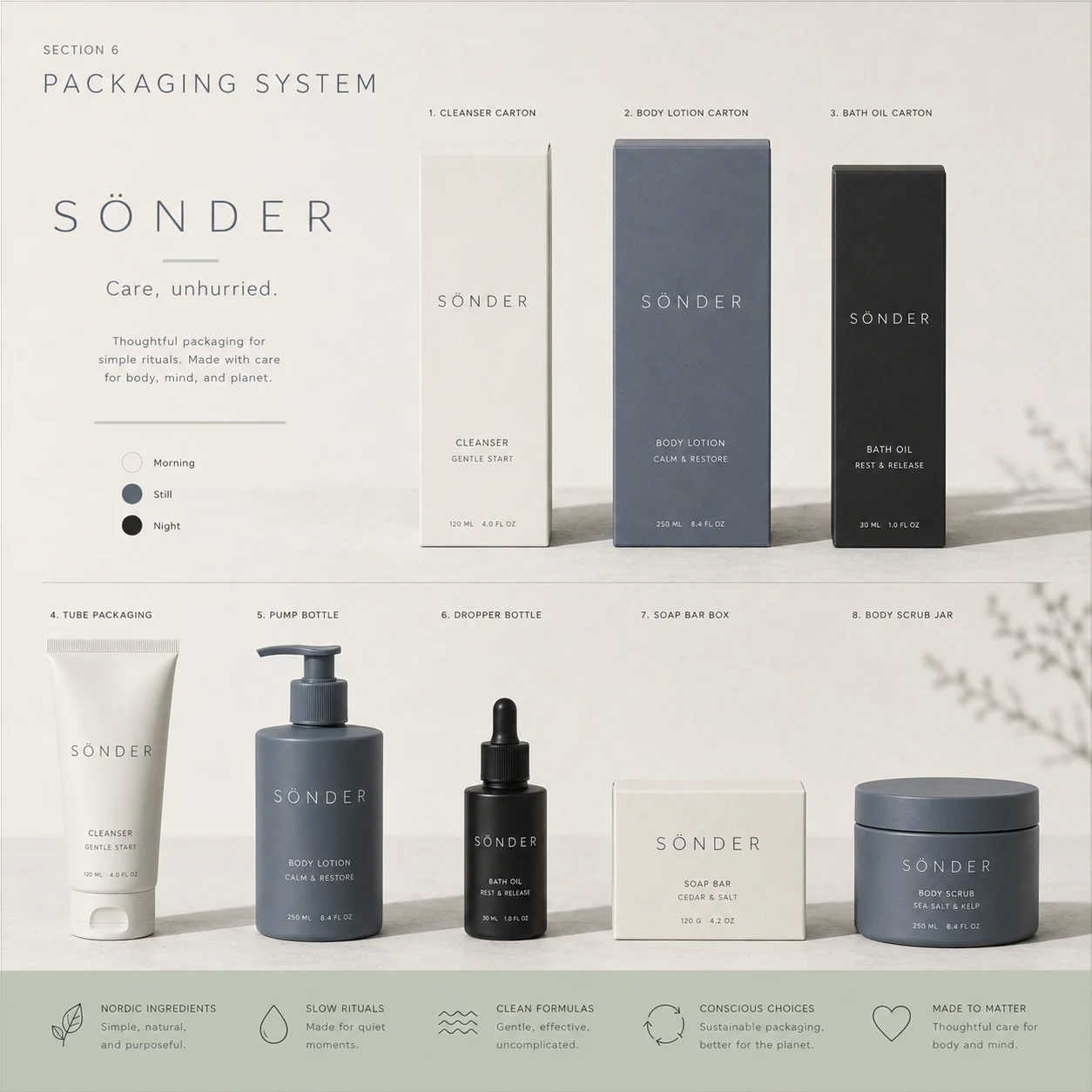
Sönder packaging system — cartons, tube, pump bottle, dropper, soap box and scrub jar
04

Materials

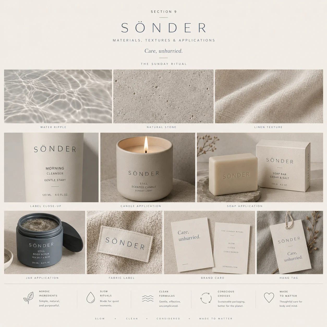
Water, stone, linen — the brand you can feel
Sönder materials and textures — water ripple, natural stone, linen, candle, soap, fabric label and hang tag
05

Campaign & digital

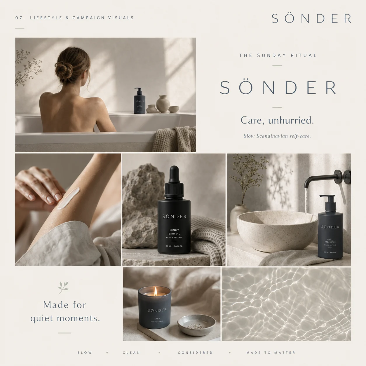
Slow, clean, considered
Sönder lifestyle and campaign visuals — bathing, skincare textures, candle and water
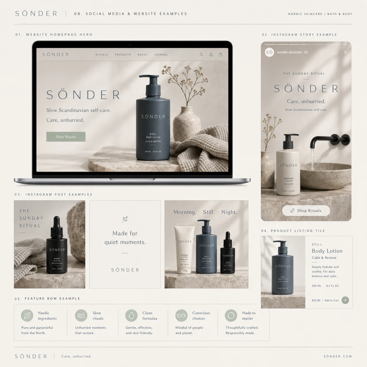
Sönder website and social media — homepage hero, Instagram story, product listing and feature row
06

The outcome

A skincare brand built on subtraction. Every element that could be removed, was — leaving a system so quiet it can sit on a bathroom shelf for years without tiring. The kind of restraint that most brands can't afford, and that this one couldn't do without.

Wordmark & submarks 8 marks
Colour & type system Full spec
Product line 3 rituals
Packaging system 8 formats
Materials & textures Art direction
Website & social E-commerce kit
Next project

Drift

View →
Close ✕