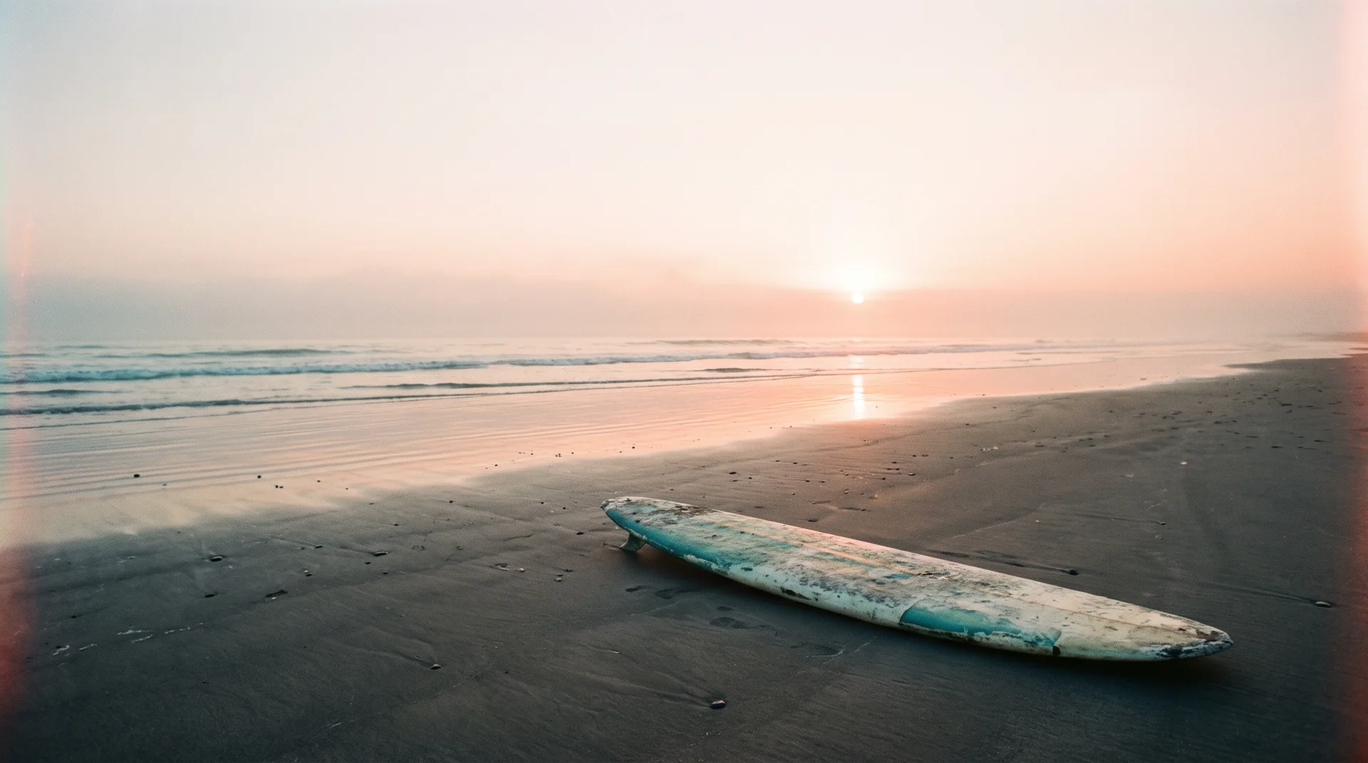
Drift — weathered surfboard on wet sand at first light, empty beach and sea haze
Brand identity · Apparel · Community · 2026

Drift

Go where it takes you.
Scroll
ClientDrift
SectorSurf & streetwear apparel
ScopeIdentity, apparel, packaging, digital
Year2026
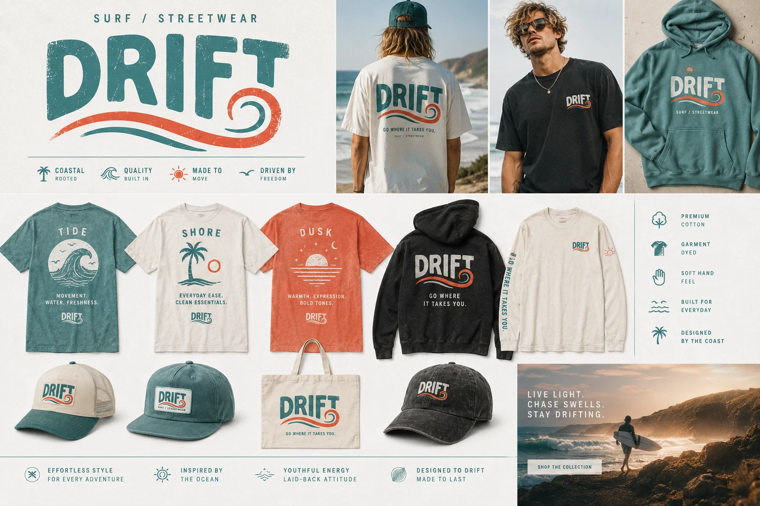
Drift apparel collection — tees, hoodie, caps and tote in faded teal, coral and charcoal
01 — THE BRIEF

Surf brands all look surfed-out

The category is stuck between two clichés: nostalgic 70s pastiche, or corporate sportswear with a wave slapped on it. Drift needed to feel young, real, and worn-in — like a brand you'd already owned for years.

02 — THE IDEA

Effortless coastal drift

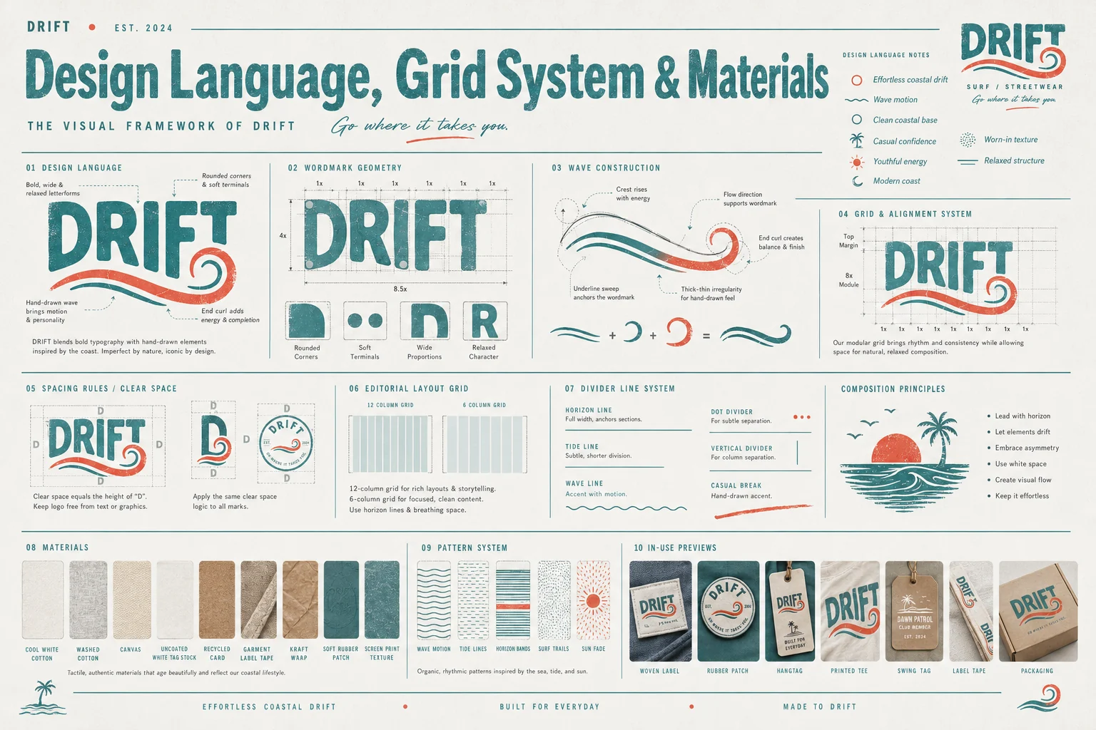
Bold, wide, rounded letterforms with a hand-drawn wave running through them — one line that starts as an underline and curls into a break. Imperfect by nature, iconic by design. It looks screen-printed even when it isn't.

03 — THE SYSTEM

Three moods, one club

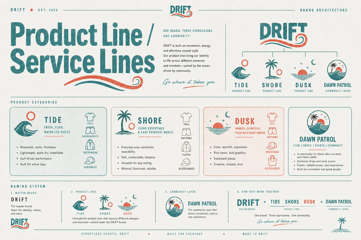
Tide, Shore and Dusk split the day into three product energies — and Dawn Patrol sits above them as the community layer. One brand, three expressions, one crew worth belonging to.
Chase swells. Live light.

Campaign line
01

The mark

A wordmark that rides its own wave
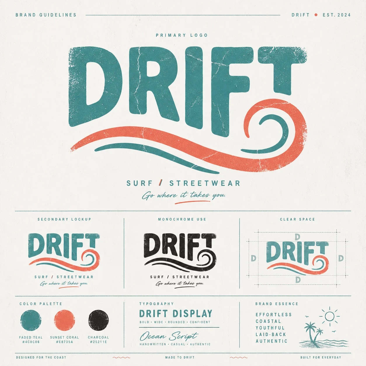
Drift primary logo — bold worn wordmark with hand-drawn teal and coral wave underline
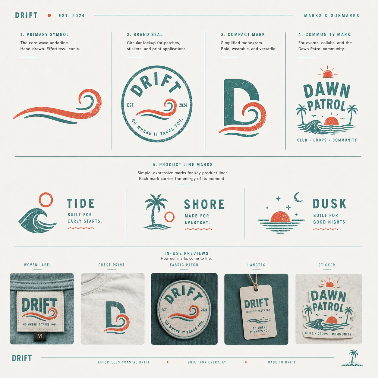
Drift marks and submarks — wave symbol, brand seal, D monogram, Dawn Patrol community mark and product line marks
02

Colour & type

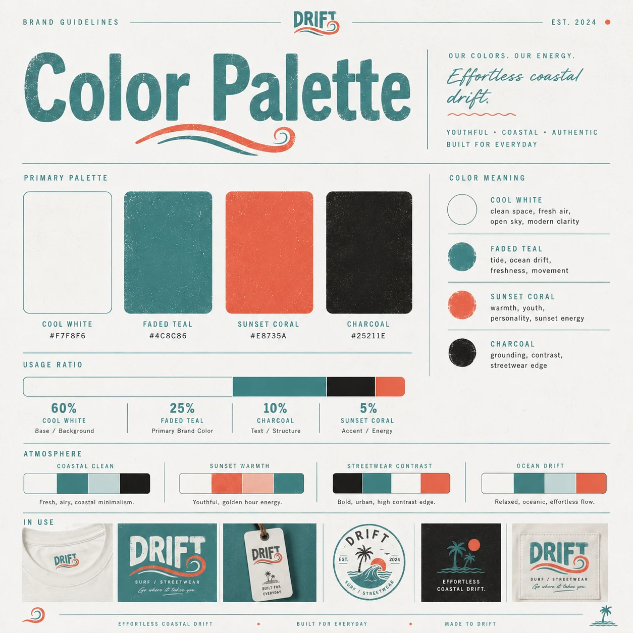
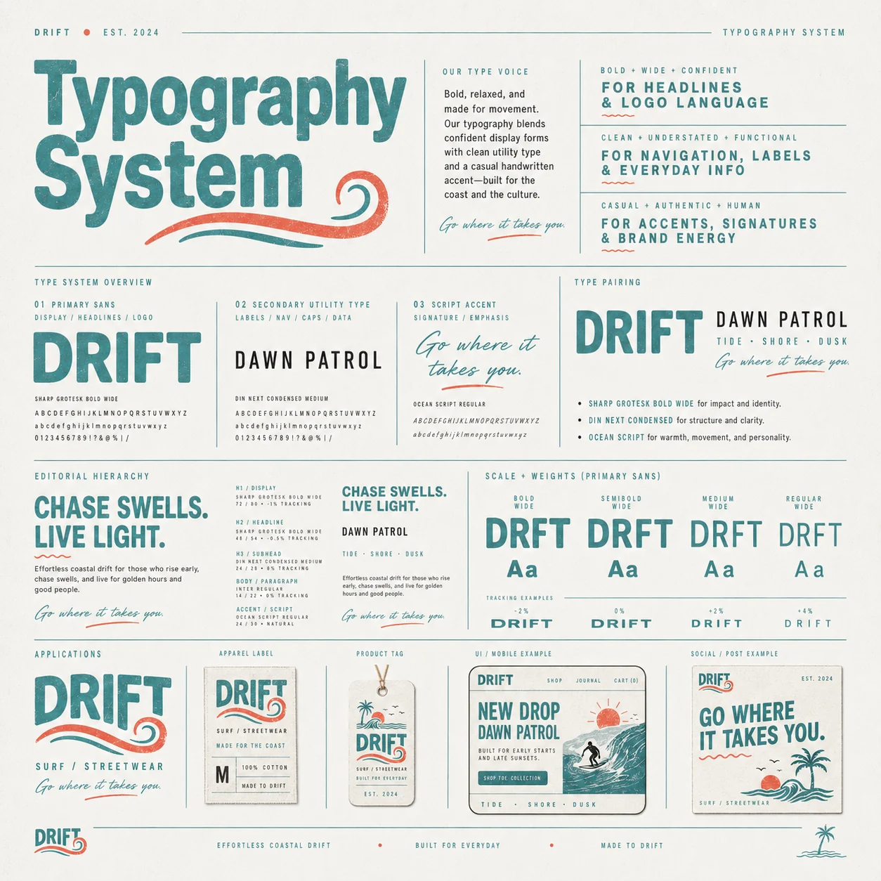
Faded teal, sunset coral, charcoal — sun-worn by design
Drift colour palette — cool white, faded teal, sunset coral and charcoal with usage ratios
Drift typography system — bold wide display sans, condensed utility type and casual script accent
03

Brand architecture

One brand. Three expressions. One community.
Tide

Movement, water, freshness. Lightweight, quick-dry, built for active days.

Shore

Clean essentials and easy everyday basics. Soft, timeless, wearable anywhere.

Dusk

Warmth and expression. Rich tones, bold graphics, statement pieces.

Dawn Patrol

The community layer — club, drops, events. More than apparel: a way of life.

04

The system

Architecture, grid and the anatomy of that wave
Drift product line and service lines — Tide, Shore, Dusk product categories and the Dawn Patrol community layer
Drift design language, grid system and materials — wordmark geometry, wave construction, patterns and fabrics
05

In the world

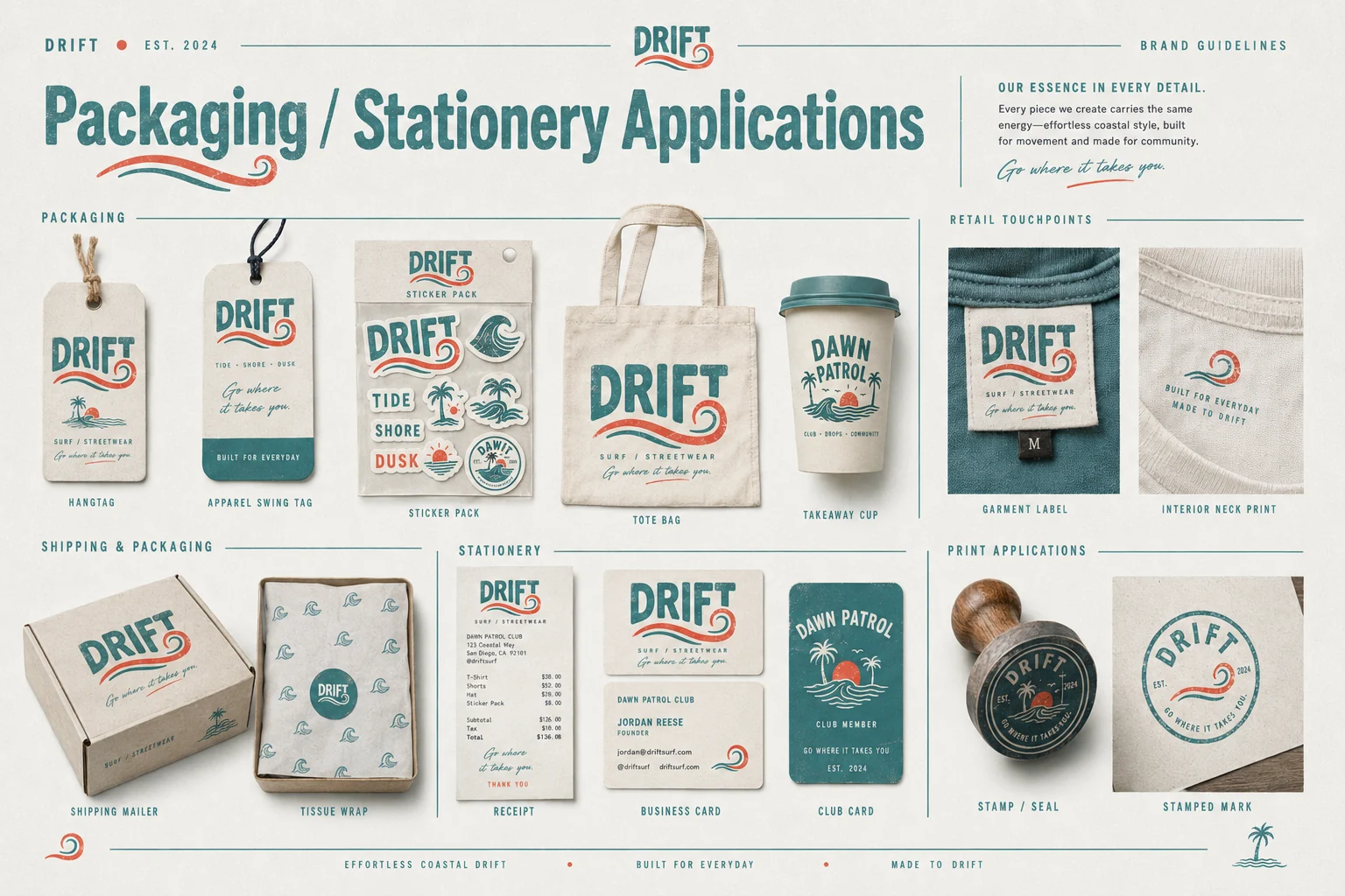
Hangtags, patches, packaging, storefront
Drift packaging and stationery — hangtags, sticker pack, tote, takeaway cup, mailer, business cards and stamp
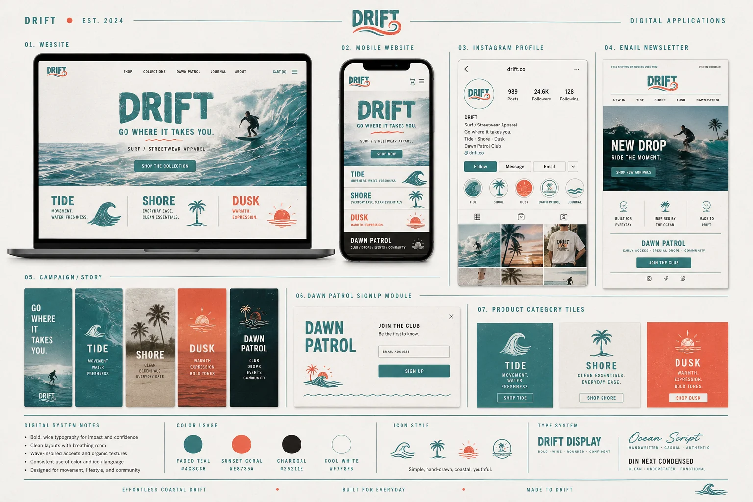
Drift digital applications — website, mobile store, Instagram profile, email newsletter and Dawn Patrol signup
06

Brand essence

Why it isn't like anything else on the rail
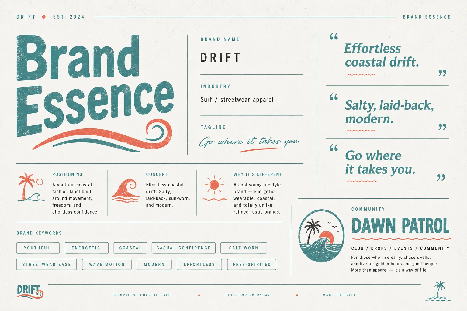
Drift brand essence — positioning, concept, keywords and the Dawn Patrol community
07

The outcome

A label that reads like it's been around for a decade. The worn texture, the hand-drawn wave and the three-line architecture give Drift room to grow without ever needing a rebrand — and Dawn Patrol turns customers into a crew. Apparel is the product; belonging is the pitch.

Wordmark & wave system 4 marks
Product line marks Tide · Shore · Dusk
Community sub-brand Dawn Patrol
Apparel & merch Full range
Packaging & hangtags 12 items
Store, email & social Digital kit
Next project

Riot & Root

View →
Close ✕