01 — THE BRIEF
Hot sauce has a taste problem
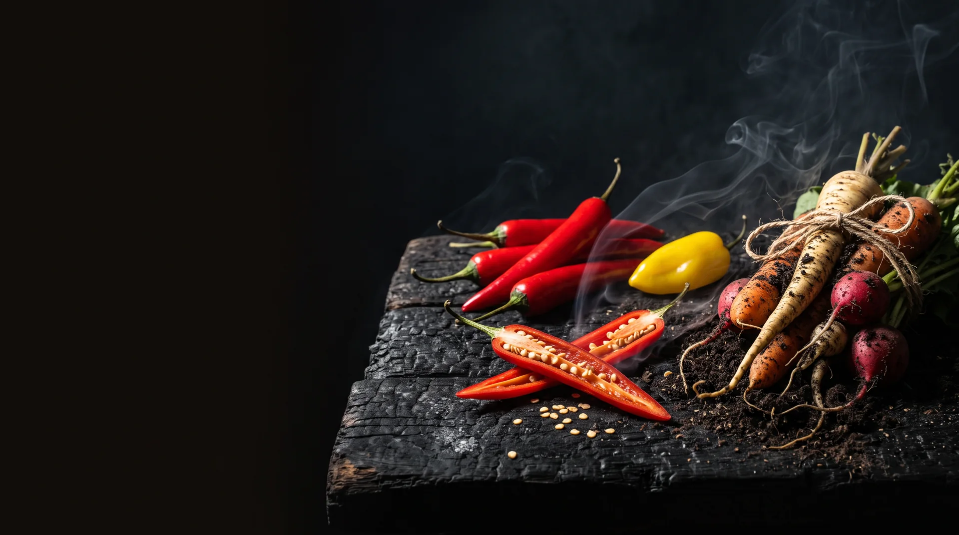
Not the sauce — the design. The shelf is split between cartoon devils and skulls on one side, and polite artisanal minimalism on the other. Riot & Root make a serious product with real garden ingredients. Neither cliché would do it justice.
02 — THE IDEA
Rebellious, but grown
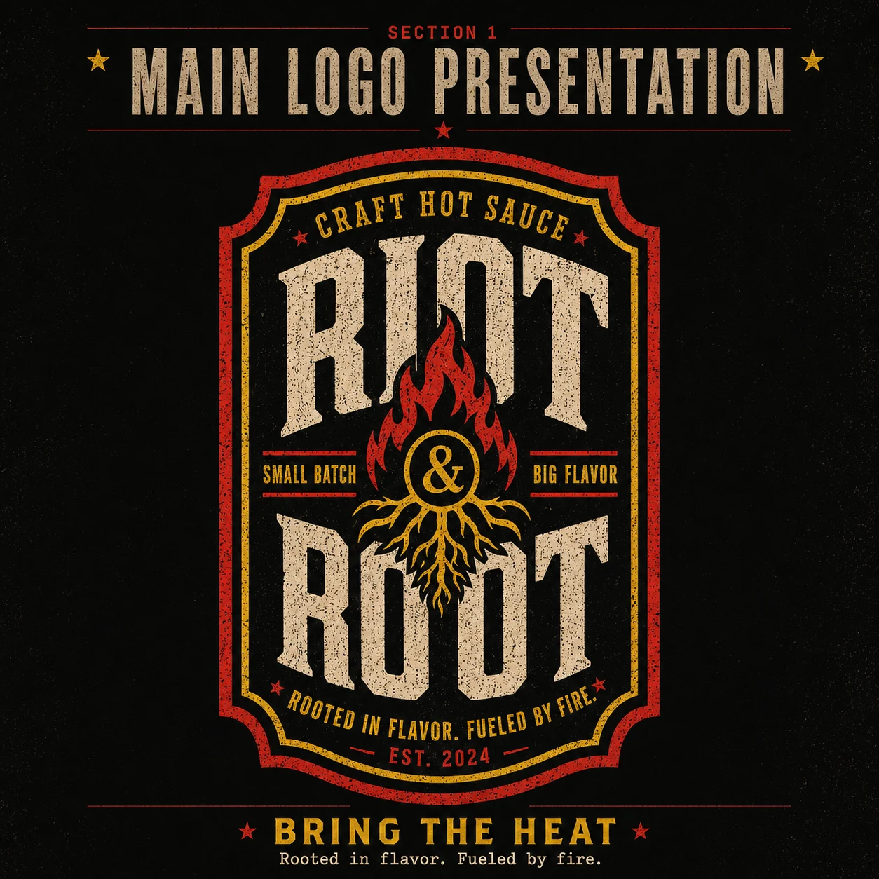
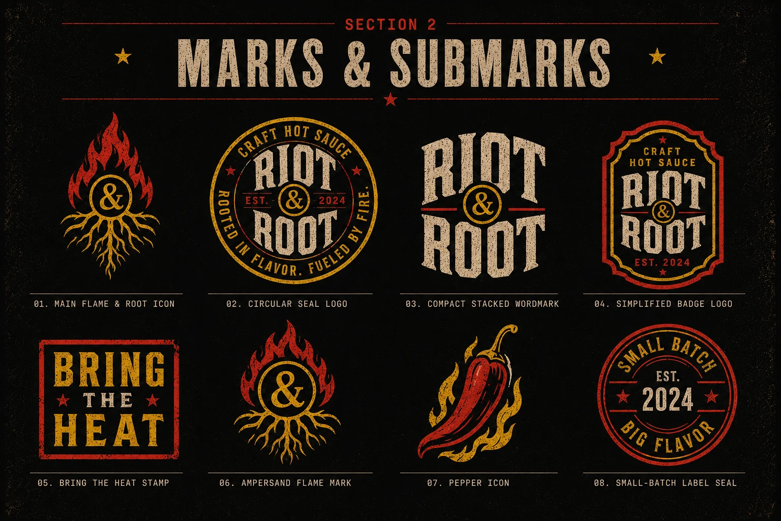
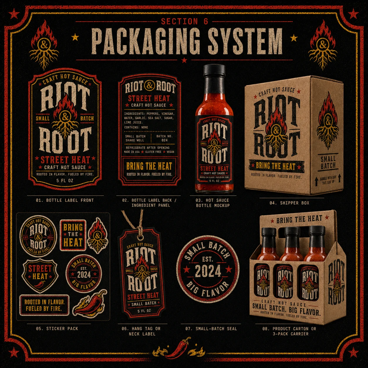
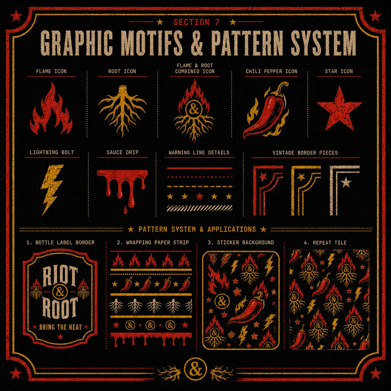
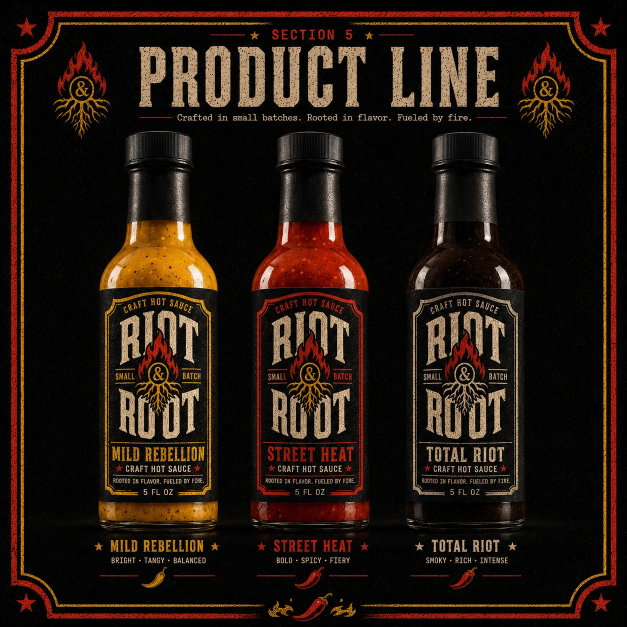
The name holds the whole tension: riot (fire, attitude) and root (the garden, the source). So the mark is a flame growing out of roots, with an ampersand at its heart — the two halves literally fused. Loud, but with something behind it.
03 — THE SYSTEM
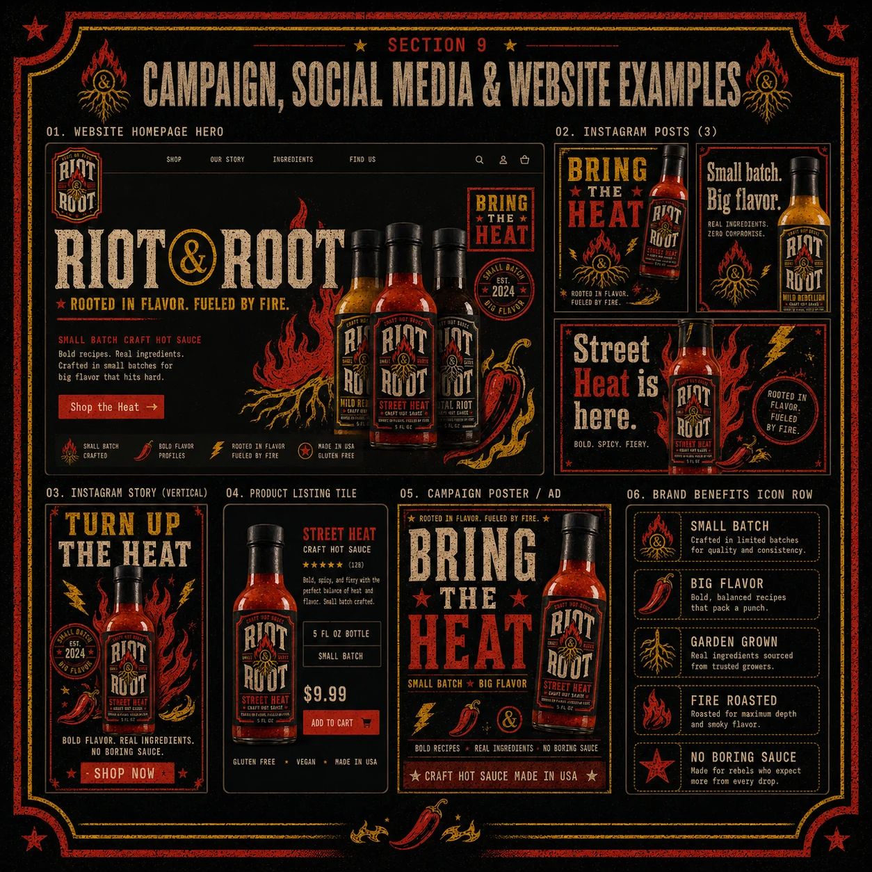
Vintage label, modern punch
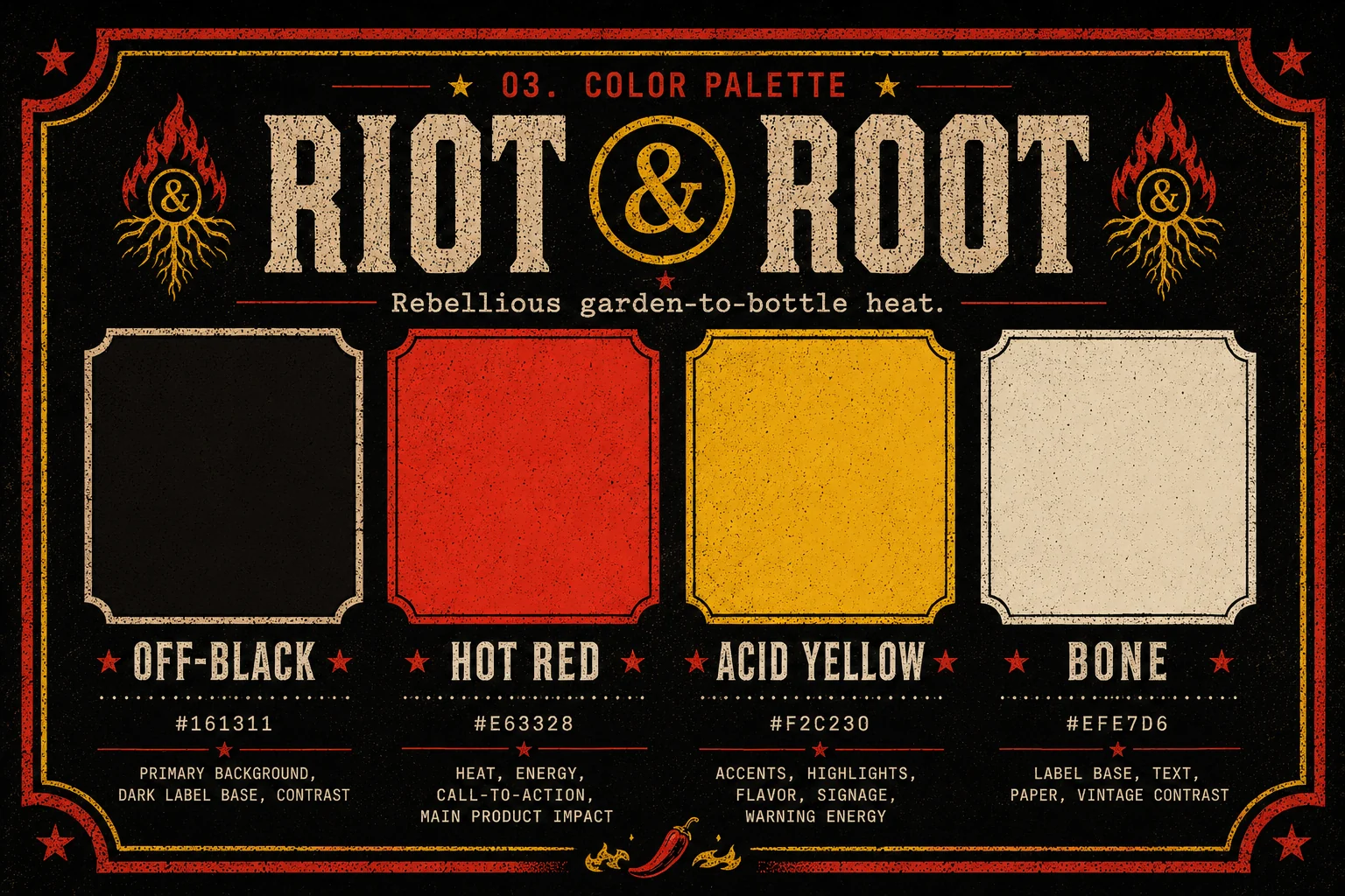
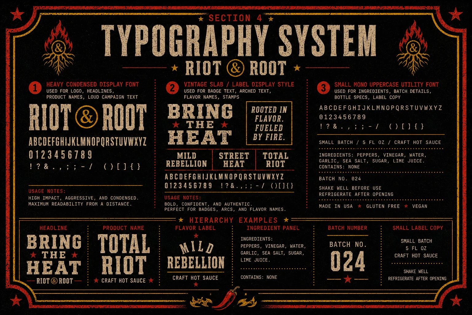
Heavy condensed type, ornate borders, stars and stamps — the visual language of an old apothecary label, cranked up in red and acid yellow on black. It looks like it's been on a shelf since 1924, and like it will take your head off.