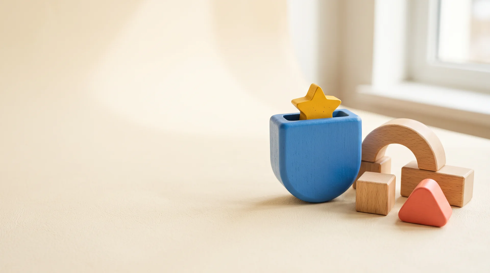
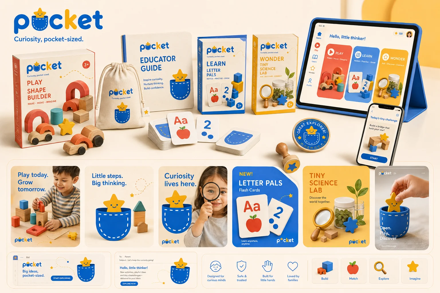
Pocket — a blue wooden pocket with a yellow star peeking out, beside beech blocks in soft daylight
Brand identity · Packaging · Digital · 2026

Pocket

Curiosity, pocket-sized.
Scroll
ClientPocket
SectorKids' educational toys
ScopeIdentity, packaging, product, digital
Year2026
Pocket full brand system — Play, Learn and Wonder kits, wooden toys, learning cards, cotton pouch, app screens and social campaign
01 — THE BRIEF

Two audiences, one box

Educational toys are bought by adults and used by children, and most brands pick a side — primary-colour chaos that parents hide in a cupboard, or beige wooden minimalism no four-year-old has ever been excited by. Pocket needed to win the shelf and the playroom.

02 — THE IDEA

A small safe place for big ideas

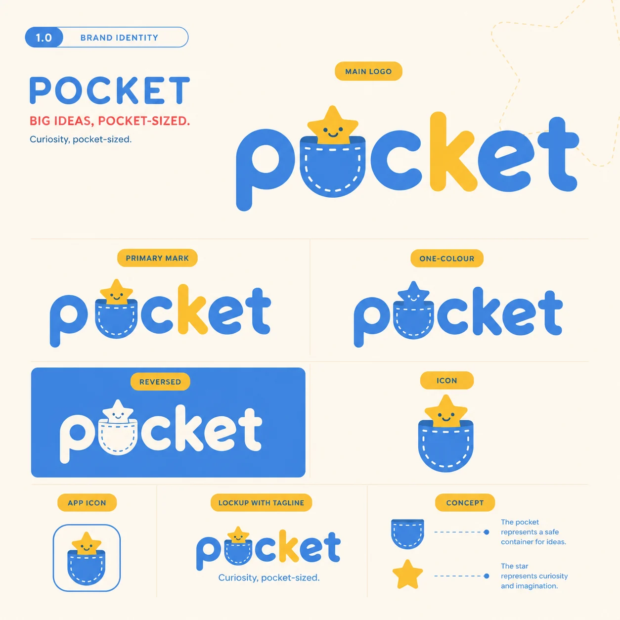
The name does the work. A pocket is where a child keeps their treasures — so the mark is a stitched pocket set into the "o", with a smiling star peeking out. Pocket = safety and containment. Star = curiosity. The whole promise, in one letter.

03 — THE SYSTEM

Joyful, but designed

Rounded forms, dashed stitch lines and generous cream space keep it warm without going saccharine. Blue leads, coral and yellow do the shouting, and a strict 8-point grid means the packaging looks as considered as anything on a grown-up shelf.
Big ideas, pocket-sized.

Brand line
01

The mark

A star peeking out of a stitched pocket
Pocket primary logo — rounded lowercase wordmark with a stitched pocket and smiling star inside the letter o, with one-colour, reversed and app icon variants
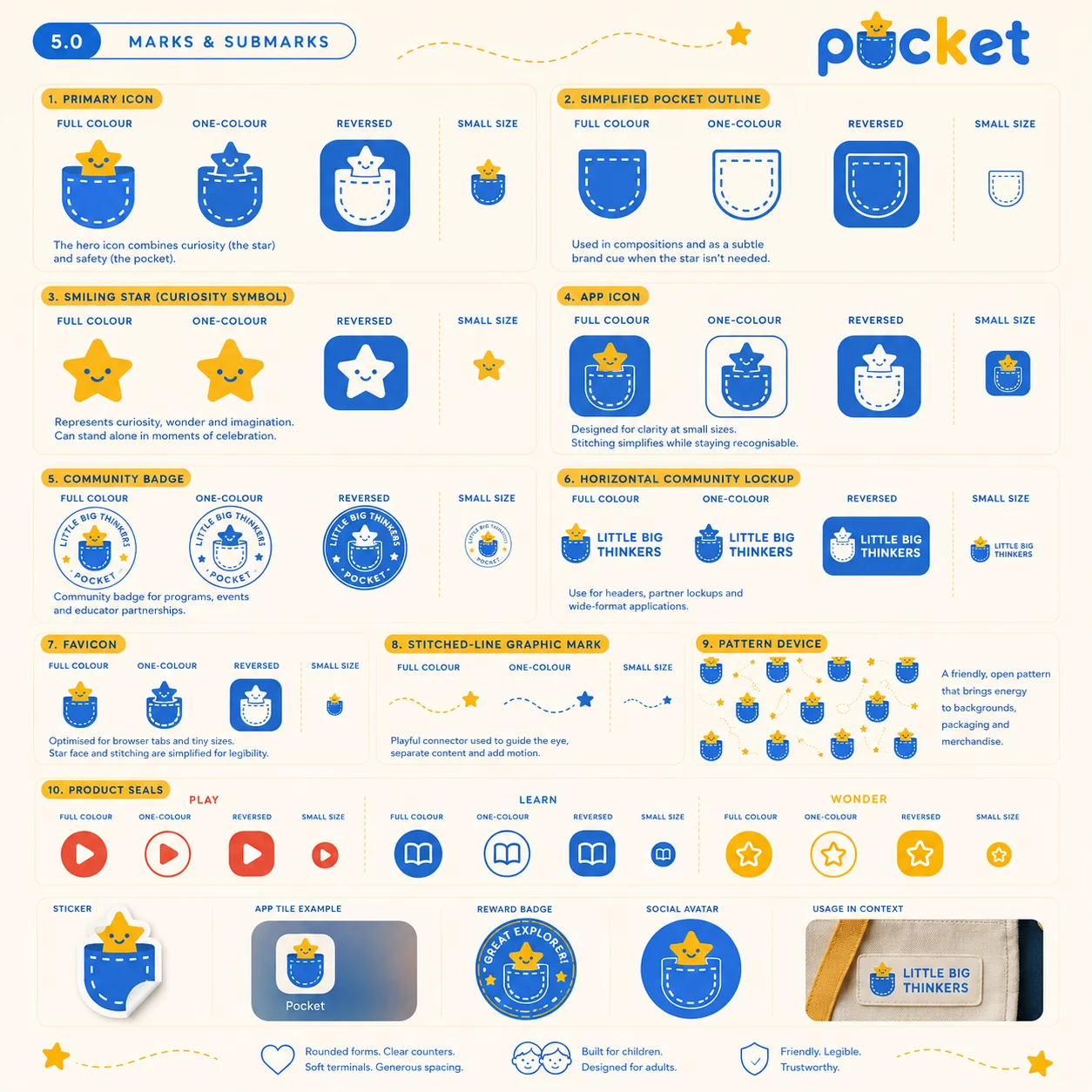
Pocket marks and submarks — primary icon, simplified pocket outline, smiling star, app icon, Little Big Thinkers community badge, favicon, pattern device and product seals
02

Colour & type

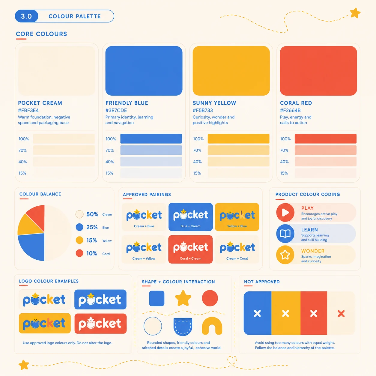
Cream 50 · Blue 25 · Yellow 15 · Coral 10
Pocket colour palette — Pocket Cream, Friendly Blue, Sunny Yellow and Coral Red with balance ratios, approved pairings and product colour coding
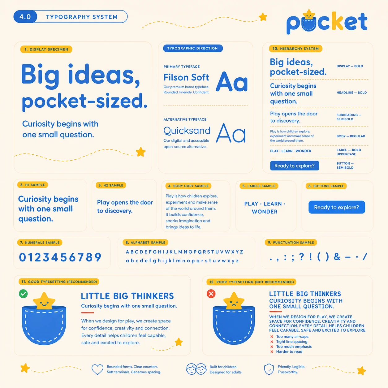
Pocket typography system — rounded sans display with full hierarchy, alphabet, numerals and good versus poor typesetting examples
03

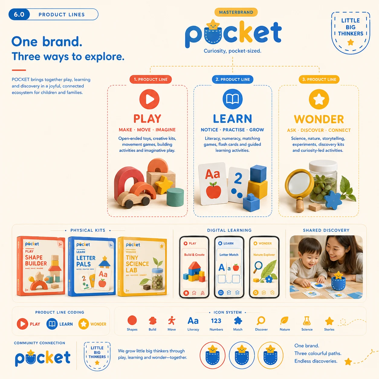
One brand, three ways to explore

A colour, a verb and a shelf each
PlayMake · Move · Imagine

Open-ended toys, creative kits, building and movement — the loud, hands-on end of the range.

LearnNotice · Practise · Grow

Literacy, numeracy, matching games and flash cards. Structured, but never school-like.

WonderAsk · Discover · Connect

Science, nature and storytelling kits for the questions that start with "but why".

Little Big Thinkers The community badge — programmes, events and educator partnerships, sitting above all three lines.
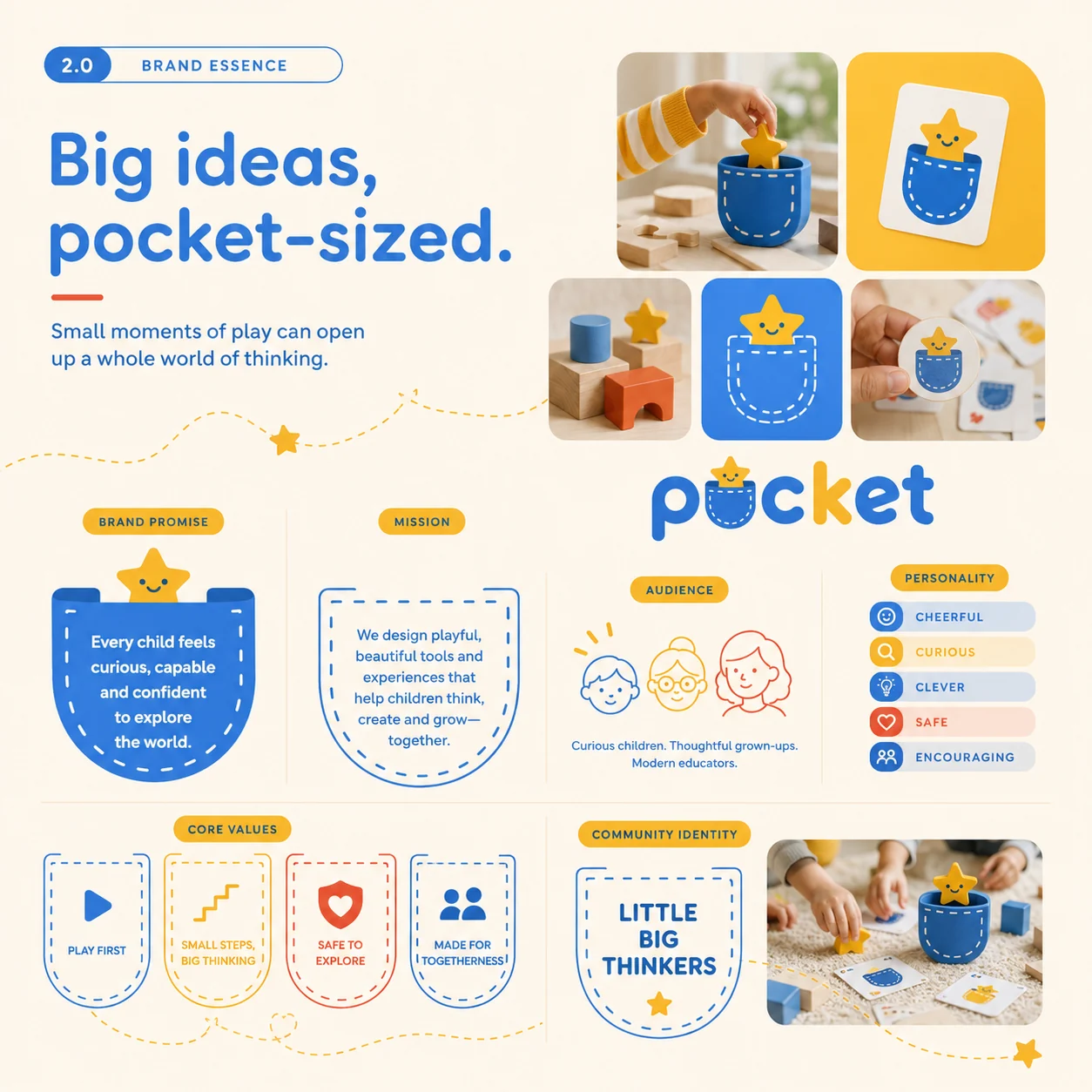
Pocket brand essence — brand promise, mission, audience, personality, core values and the Little Big Thinkers community identity
Pocket product lines — Play, Learn and Wonder architecture with physical kits, digital learning and shared discovery, plus the icon system
04

Packaging & design language

Boxes a parent will leave out on the shelf
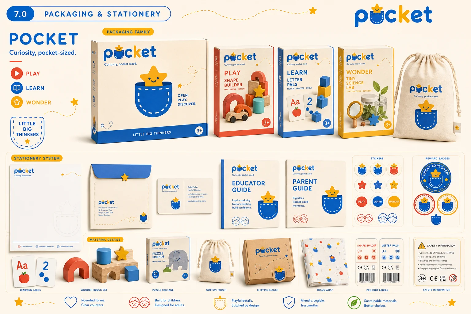
Pocket packaging and stationery — kit boxes for Shape Builder, Letter Pals and Tiny Science Lab, cotton pouch, guides, stickers, reward badges and safety information
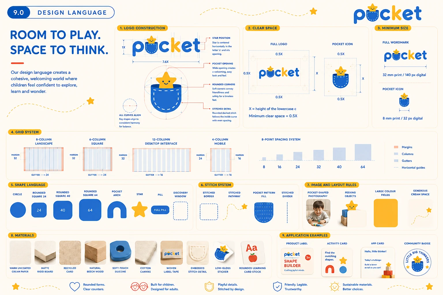
Pocket design language — logo construction, clear space, grid and 8-point spacing system, shape and stitch language, materials and application examples
05

Digital

A child's app and a parent's dashboard, same family
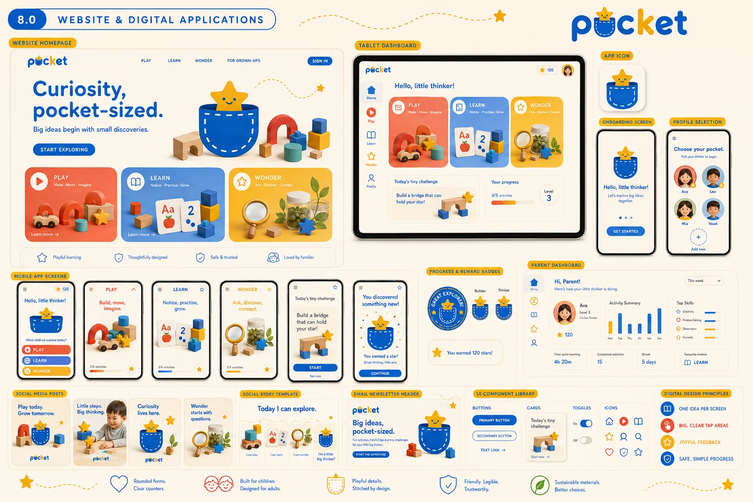
Pocket website and digital applications — homepage, tablet dashboard, mobile app screens, reward badges, parent dashboard, social posts and UI component library
06

The outcome

A toy brand that a child can recognise before they can read, and a parent is happy to have on the shelf. Play / Learn / Wonder gives the range a colour-coded spine that scales — new kits slot straight into an existing shelf, an existing app tab and an existing badge. And because the star and the pocket work down to a 32px favicon, the identity survives everywhere it has to live: a box, a sticker, an app tile, a stitched label on a cotton pouch.

Logo & icon suite Full set
Colour & type system 4 colours
Product architecture 3 lines
Packaging family Kits + retail
Stationery & stickers Full kit
App & website UI system
Community brand Little Big Thinkers
Next project

Fern & Flint

View →
Close ✕