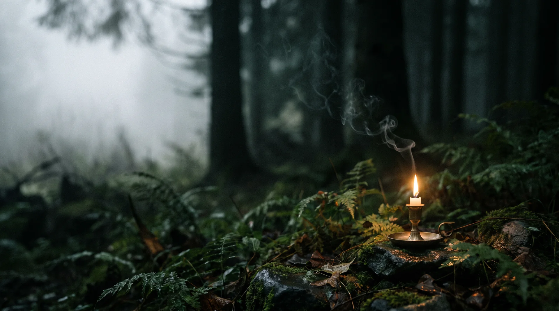
Fern & Flint — a single candle burning on a mossy forest floor among ferns, fog between dark trunks
Brand identity · Packaging · E-commerce · 2026

Fern & Flint

Light something slow.
Scroll
ClientFern & Flint
SectorHome fragrance
ScopeIdentity, packaging, print, e-commerce
Year2026
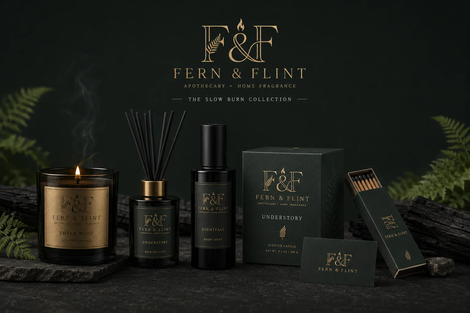
Fern & Flint Slow Burn collection — smoked glass candle, reed diffuser, room spray, rigid candle box, matchbox and business card on stone
01 — THE BRIEF

The candle aisle is a beige wall

Premium home fragrance has settled into one look: cream label, thin sans, a word like Calm. It photographs well and says nothing. Fern & Flint make slow-burning, apothecary-grade candles and needed a brand with an actual atmosphere — one you can smell before you lift the lid.

02 — THE IDEA

Forest meets fire

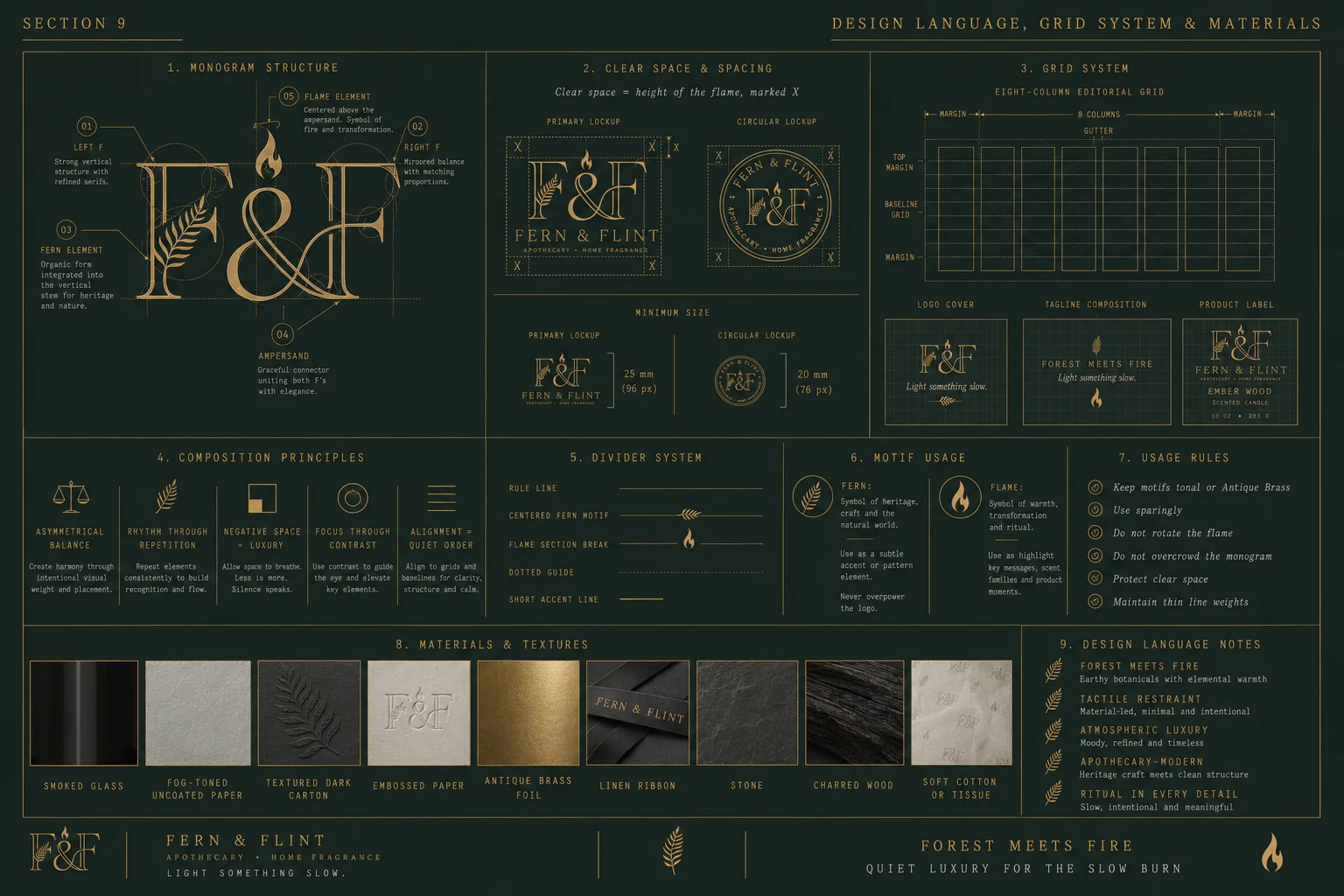
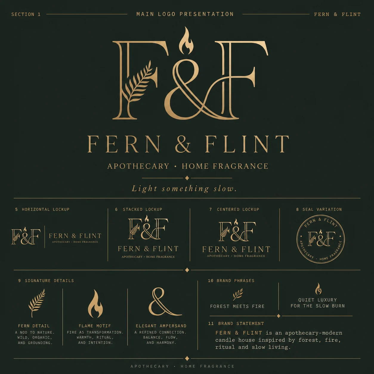
The name is a collision: fern (damp, green, growing) and flint (spark, heat, transformation). The monogram stages it — a fern grows up through the left F, a flame sits above the ampersand, and the two are joined by a single ligature. Soft thing, hard thing, one mark.

03 — THE SYSTEM

Dark, tactile, unhurried

Forest black-green carries everything, brass appears only where light would fall, fog grey-green does the reading. Smoked glass, embossed carton, linen ribbon, wax seal. Thin rules, ample tracking, a lot of empty space — the layout equivalent of a slow burn.
Quiet luxury for the slow burn.

Brand line
01

The monogram

Fern, flame and ampersand in one ligature
Fern & Flint primary logo — F&F monogram with fern detail and flame motif, plus horizontal, stacked and centred lockups and circular seal
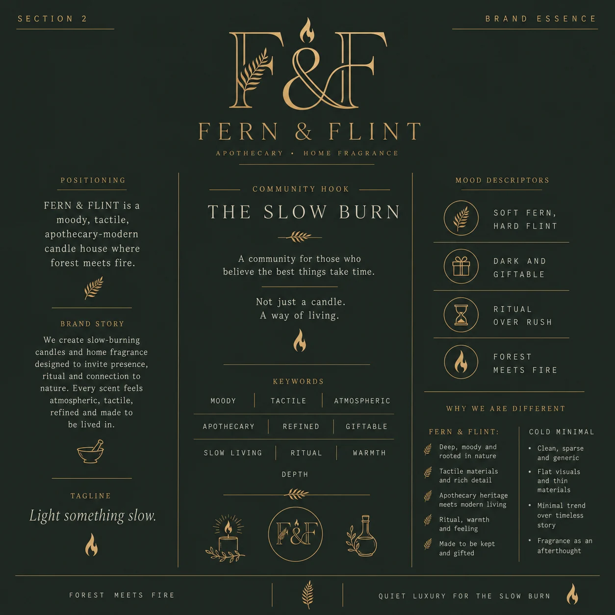
Fern & Flint brand essence — positioning, brand story, tagline, The Slow Burn community hook, keywords and mood descriptors
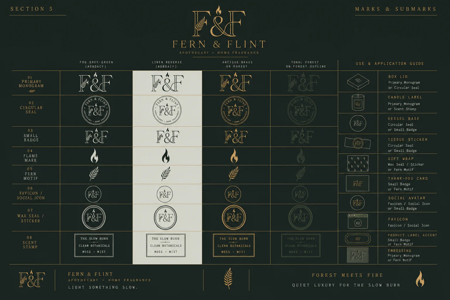
Fern & Flint marks and submarks — monogram, circular seal, small badge, flame mark, fern motif, favicon, wax seal and scent stamp across four colourways
02

Colour & type

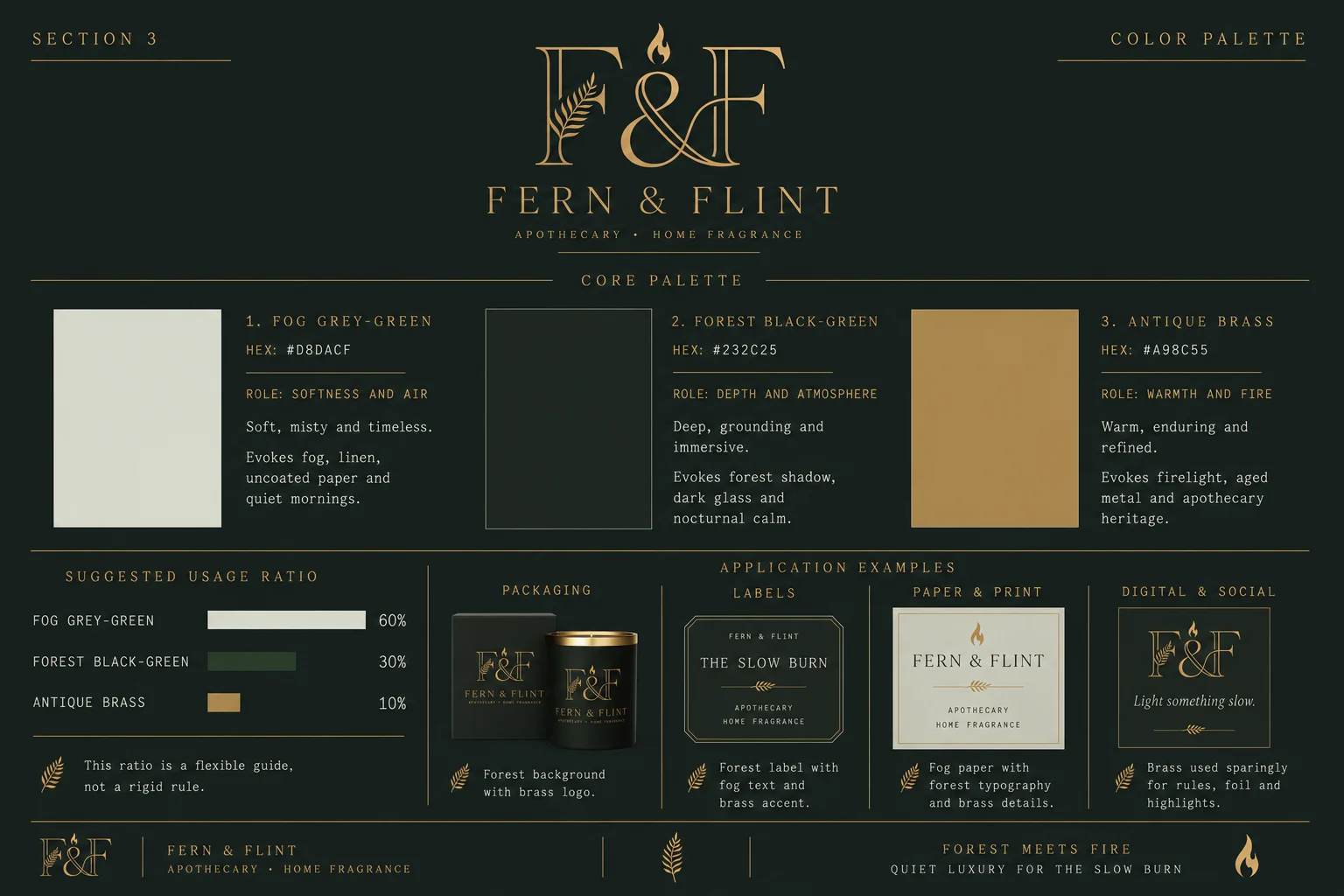
Fog 60 · Forest 30 · Brass 10
Fern & Flint colour palette — fog grey-green, forest black-green and antique brass with roles, usage ratios and application examples
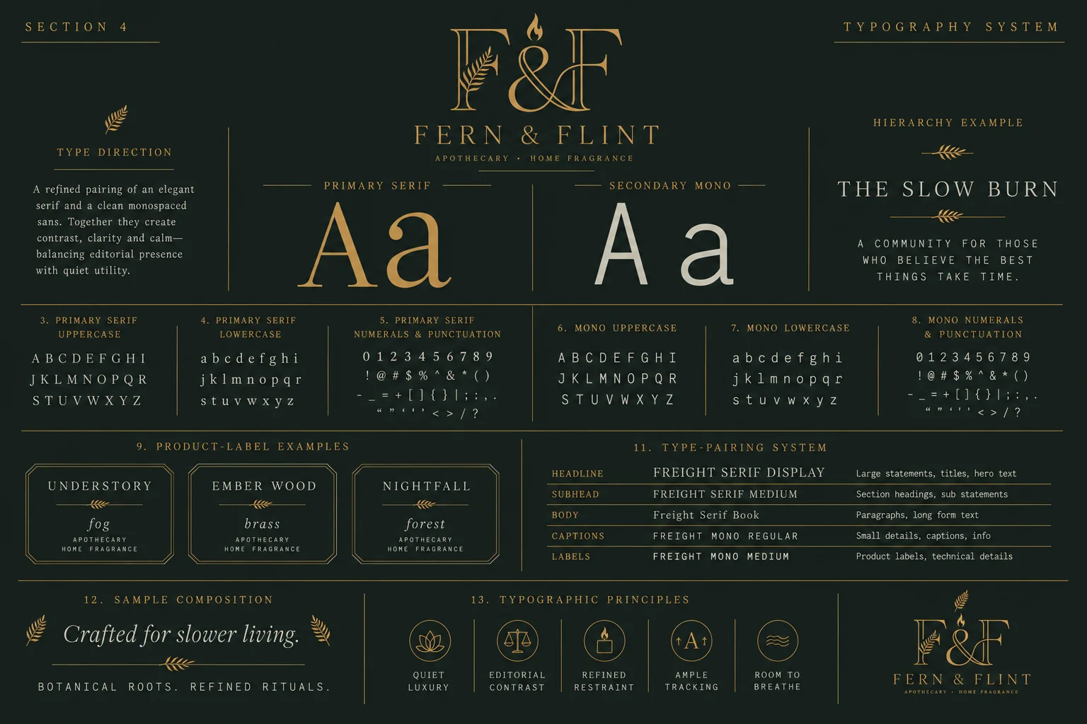
Fern & Flint typography system — elegant serif paired with a clean monospaced sans, full character set, product-label examples and type-pairing hierarchy
03

The Slow Burn Collection

Three scents, three colourways, one ritual
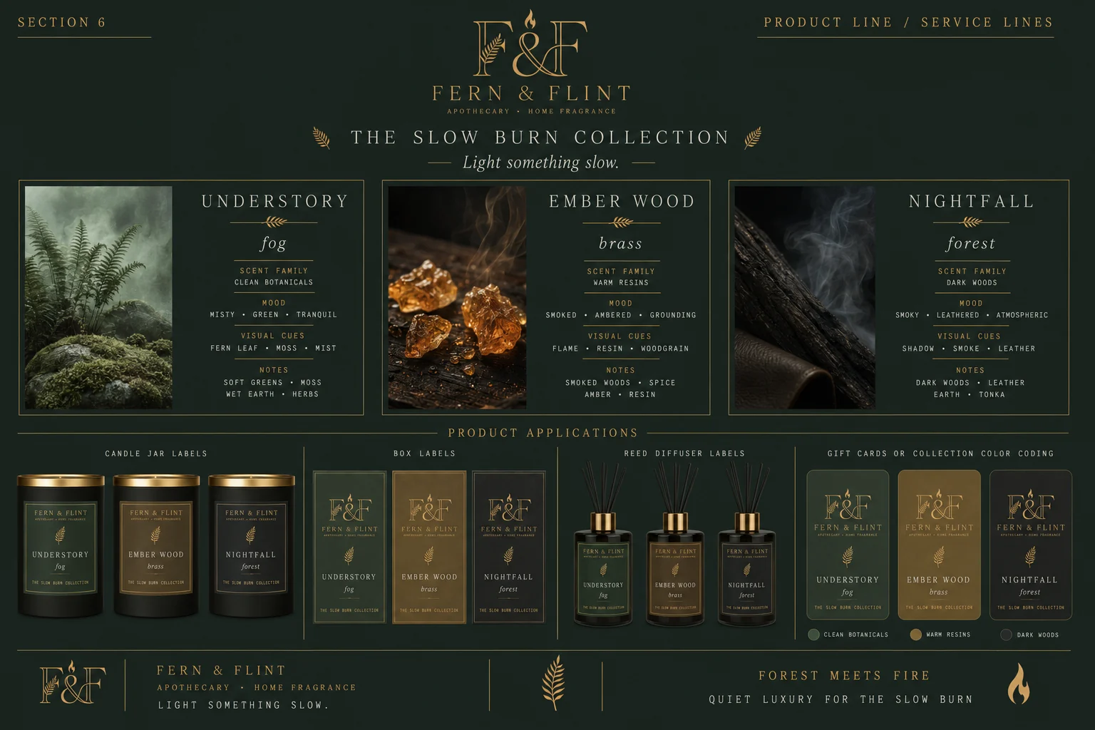
UnderstoryfogClean botanicals

Soft greens, moss, wet earth and herbs. Misty, green, tranquil — the forest floor at first light.

Ember WoodbrassWarm resins

Smoked woods, spice, amber and resin. The hero of the range, and the one that ends up gifted.

NightfallforestDark woods

Dark woods, leather, earth and tonka. Smoky, leathered, atmospheric — the late end of the evening.

Fern & Flint product line — The Slow Burn collection with scent families, moods and notes, plus candle jar, box and reed diffuser label systems
04

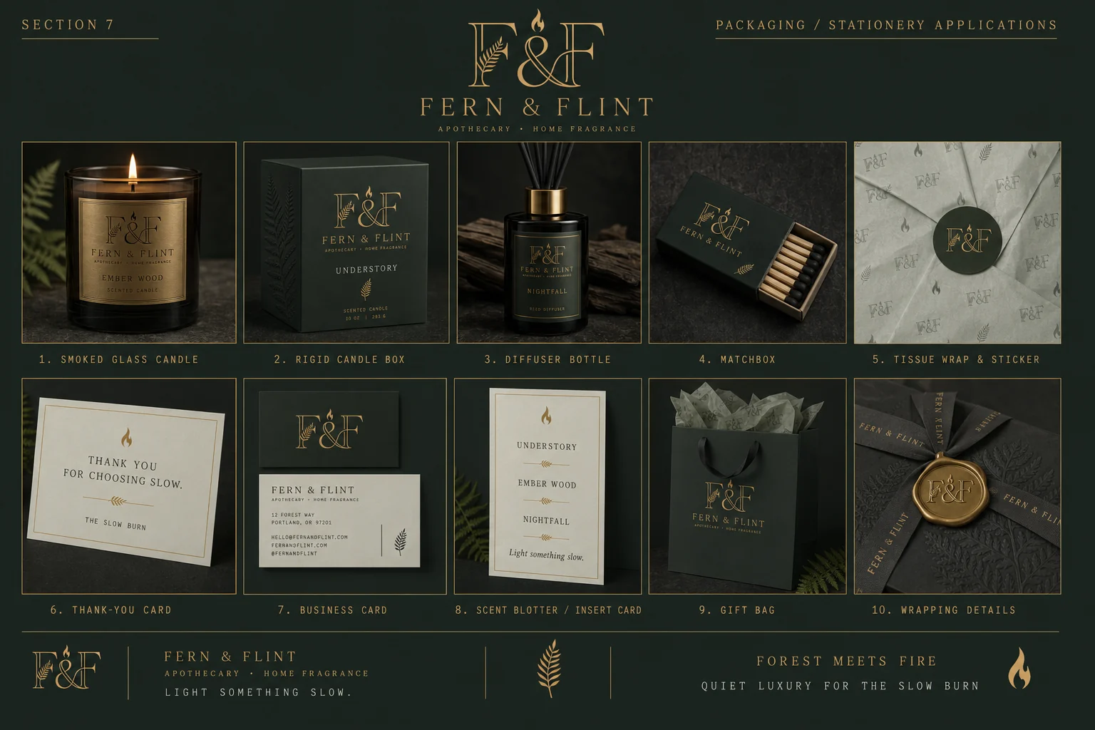
Packaging & design language

Smoked glass, embossed carton, brass foil, wax seal
Fern & Flint packaging and stationery — smoked glass candle, rigid box, diffuser bottle, matchbox, tissue wrap, thank-you card, business card, gift bag and wax-sealed wrapping
Fern & Flint design language — monogram construction, clear space, editorial grid, composition principles, divider system, motif rules and material palette
05

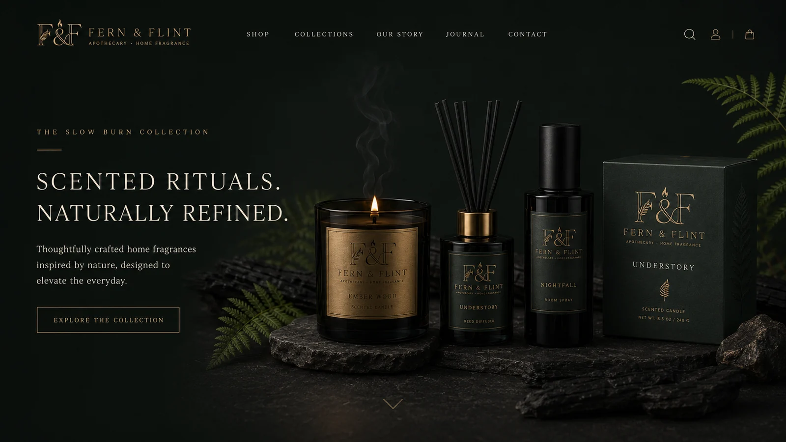
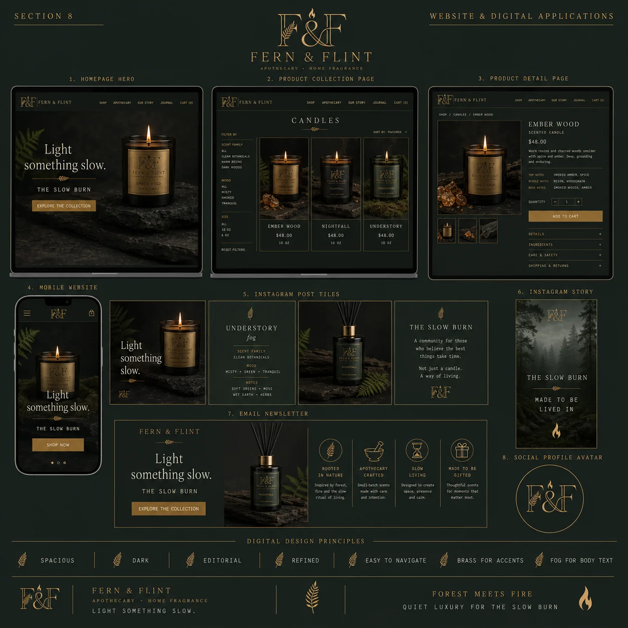
E-commerce

A dark storefront that still sells
Fern & Flint website homepage — dark hero with the Slow Burn collection, navigation and explore-the-collection call to action
Fern & Flint digital applications — homepage hero, collection and product detail pages, mobile site, Instagram tiles and story, email newsletter and social avatar
06

The outcome

A candle house that looks like a gift before it is wrapped. The Slow Burn structure gives the range a colour system that does real work — fog, brass and forest code the labels, the boxes, the diffusers and the gift cards, so a fourth scent needs a name and a colourway, not a redesign. And because the identity was built material-first — foil on card, emboss on carton, wax on ribbon — it survives the jump from a photograph to an actual shelf.

Monogram & lockups Full suite
Marks & submarks 8 marks
Colour & type system Editorial
Collection architecture 3 scents
Packaging & unboxing 10 items
Print & stationery Full kit
E-commerce & social Digital system
Next project

Kettle & Crow

View →
Close ✕