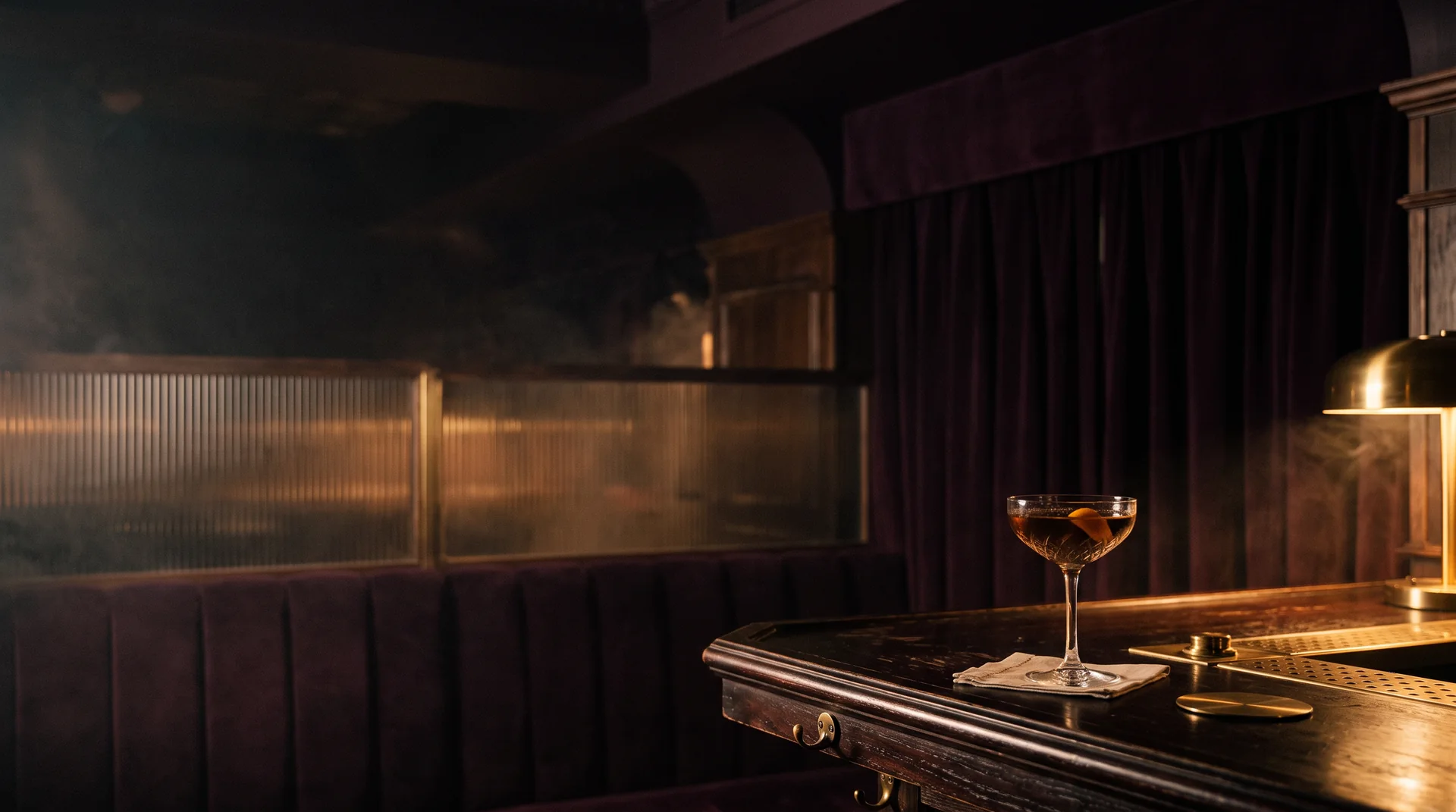
Nocturn — a coupe glass on a dark bar top, plum velvet banquette and brass lamp in low light
Brand identity · Hospitality · 2026

Nocturn

The night, poured.
Scroll
ClientNocturn Lounge
SectorCocktail bar & late-night lounge
ScopeIdentity, packaging, digital
Year2026
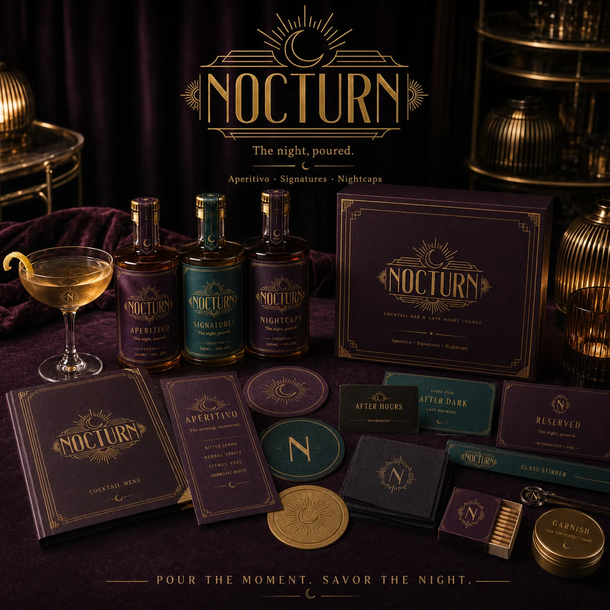
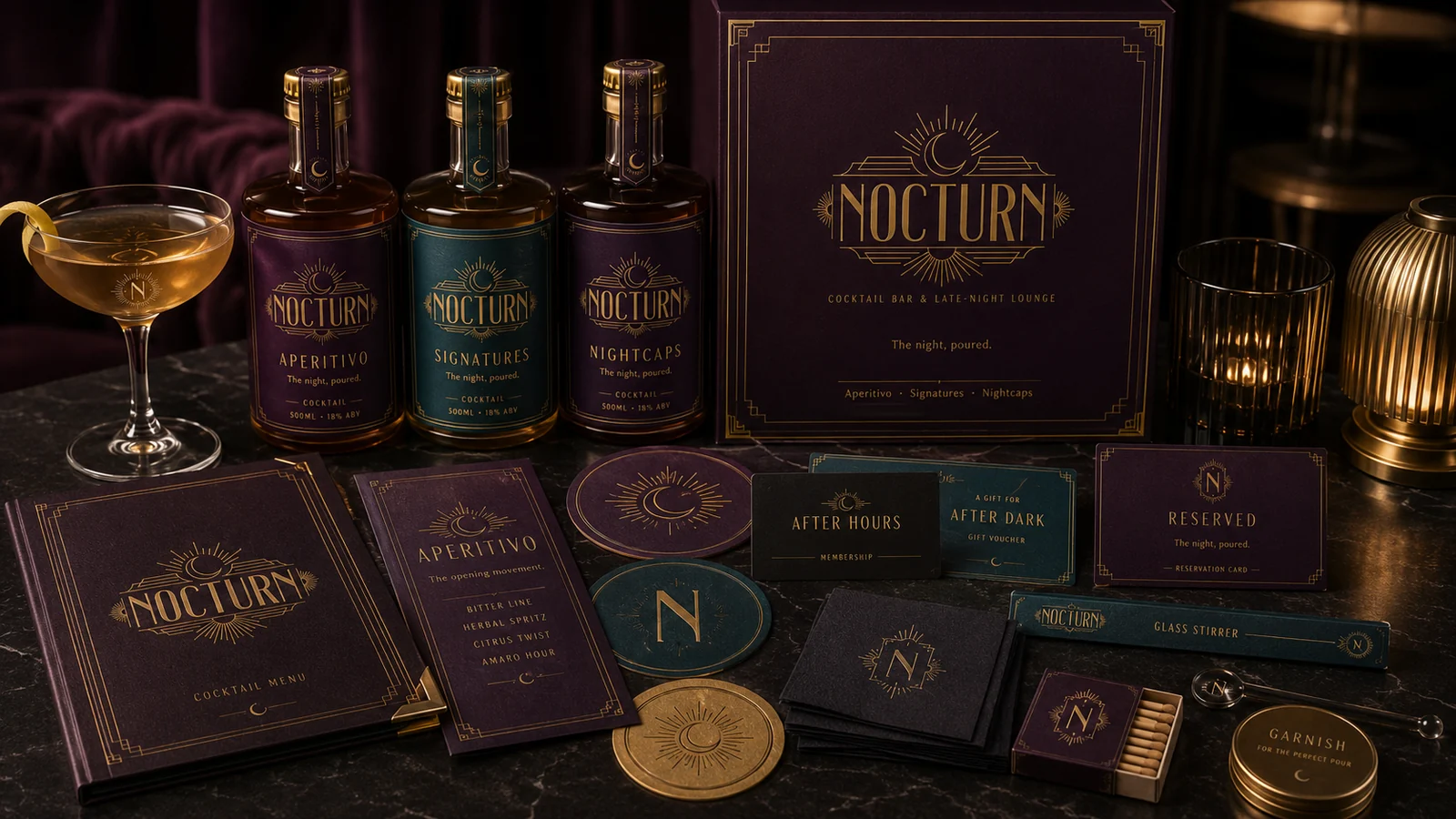
Nocturn cocktail bar branding — bottles, menus, coasters and gift box in deep plum and champagne gold
01 — THE BRIEF

A bar with no voice

Nocturn is a late-night cocktail lounge with theatrical drinks and an intimate room — but nothing to say for itself. Every touchpoint, from the menu to the door, looked like a hundred other bars. The experience was premium. The brand wasn't.

02 — THE IDEA

After-dark sophistication

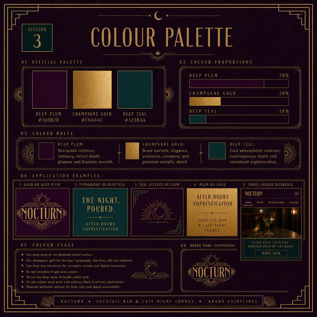
We built the identity around a single promise: every visit feels like entering another hour of the night. Art-deco geometry, a crescent moon crowning the wordmark, and a palette of deep plum, champagne gold and teal — low light, brass and velvet, translated into design.

03 — THE SYSTEM

One night, three movements

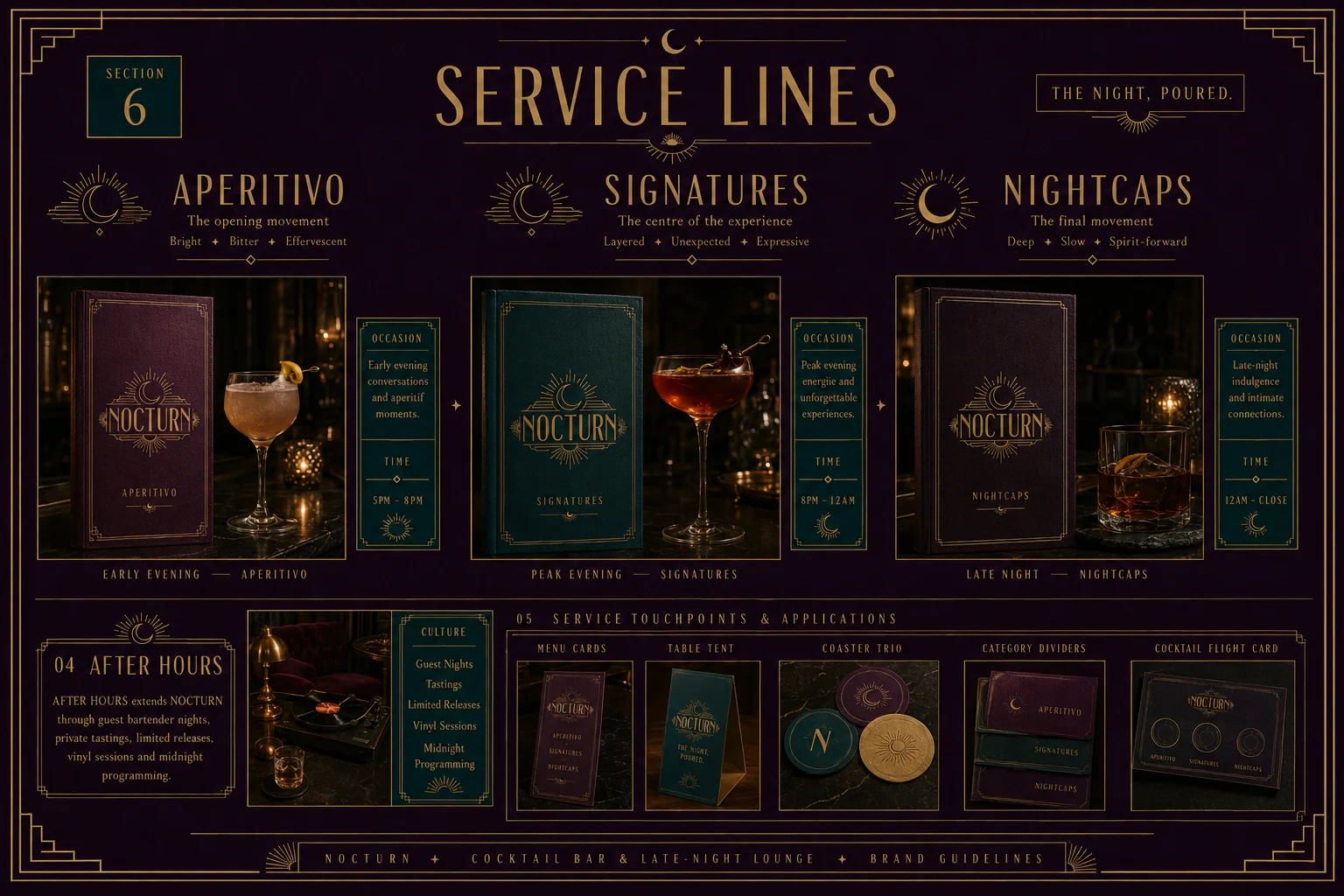
The menu became a story with structure: Aperitivo, Signatures, Nightcaps — the opening, the centre, the final movement. That rhythm carries the whole brand, from the bottles to the booking flow.
Every visit feels like entering another hour of the night.

Brand promise
01

The mark

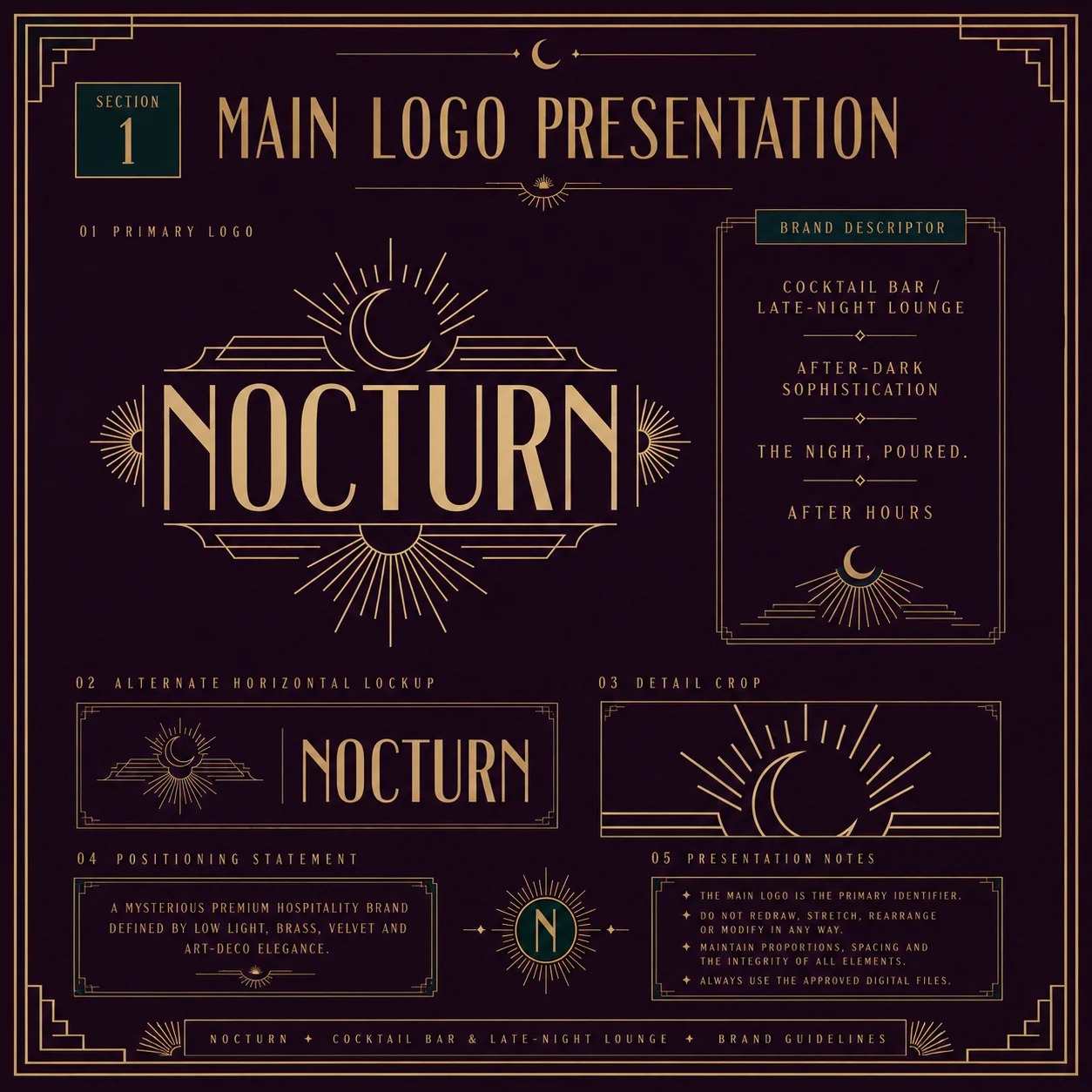
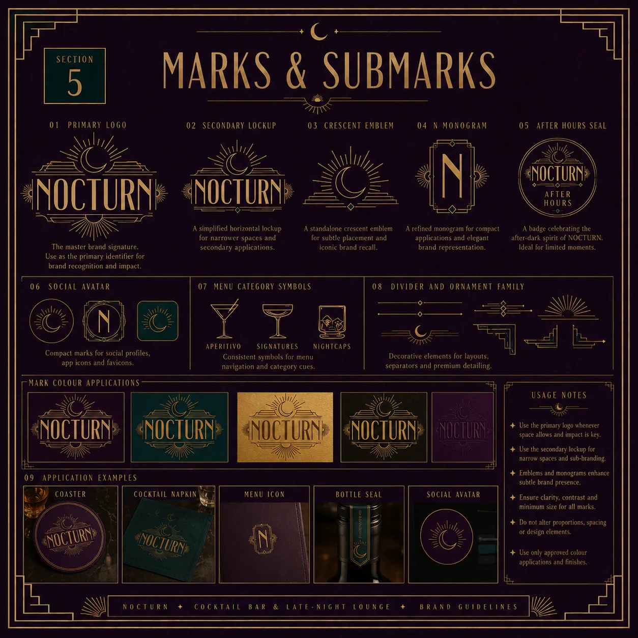
Primary logo, submarks and the crescent emblem
Nocturn primary logo presentation — art-deco wordmark with crescent moon and sunburst rays
Nocturn marks and submarks — secondary lockup, crescent emblem, N monogram and After Hours seal
02

Essence & colour

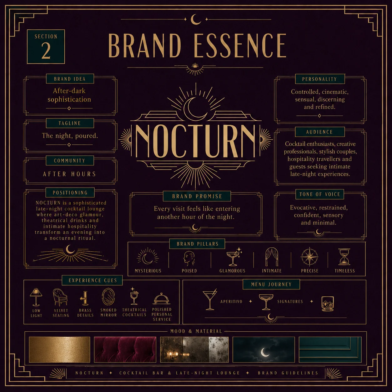
The strategy behind every visual decision
Nocturn brand essence — positioning, personality, audience, tone of voice and brand pillars
Nocturn colour palette — deep plum, champagne gold and deep teal with usage proportions
03

Typography

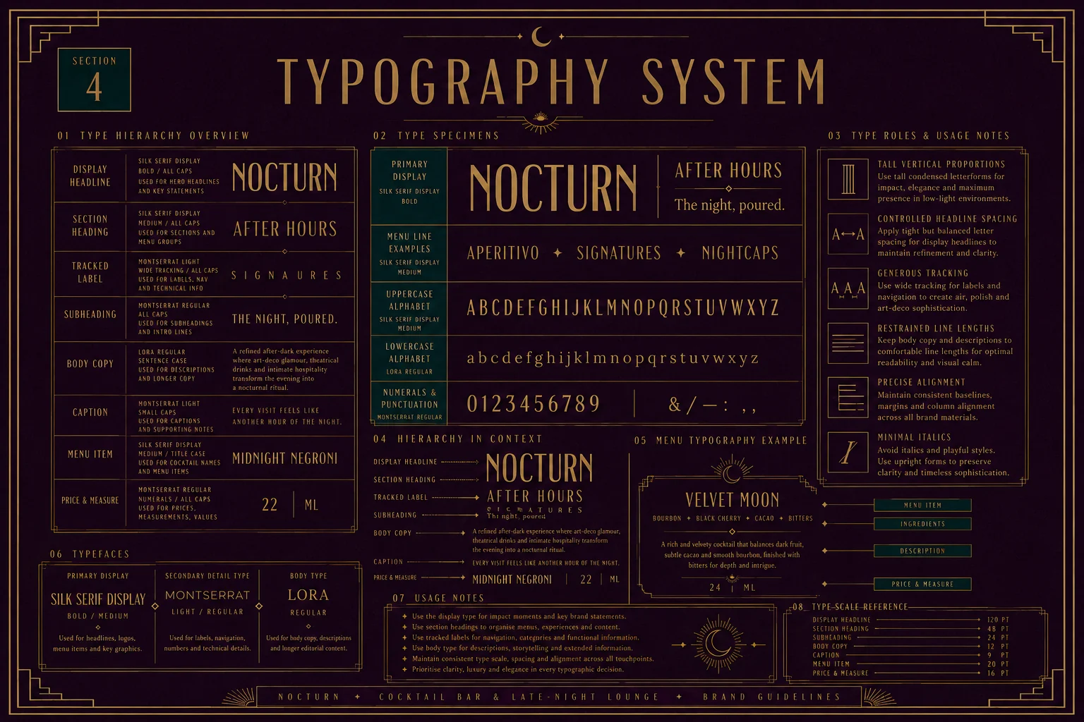
Tall deco letterforms, built for low light
Nocturn typography system — display serif, Montserrat and Lora with full type hierarchy
04

Service lines

Aperitivo · Signatures · Nightcaps
Nocturn service lines — three menu movements across the evening with occasion and timing
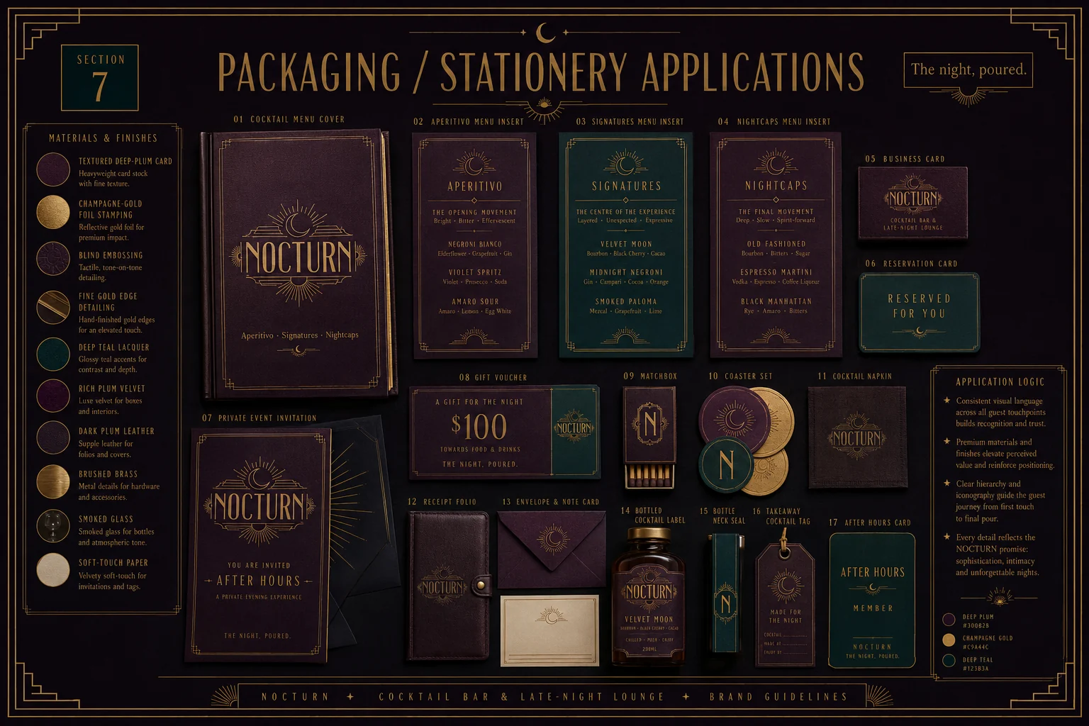
Nocturn packaging and stationery — menu covers, business cards, matchbox, coasters and bottle labels
05

Digital

Reservation-first, cinematic, quiet motion
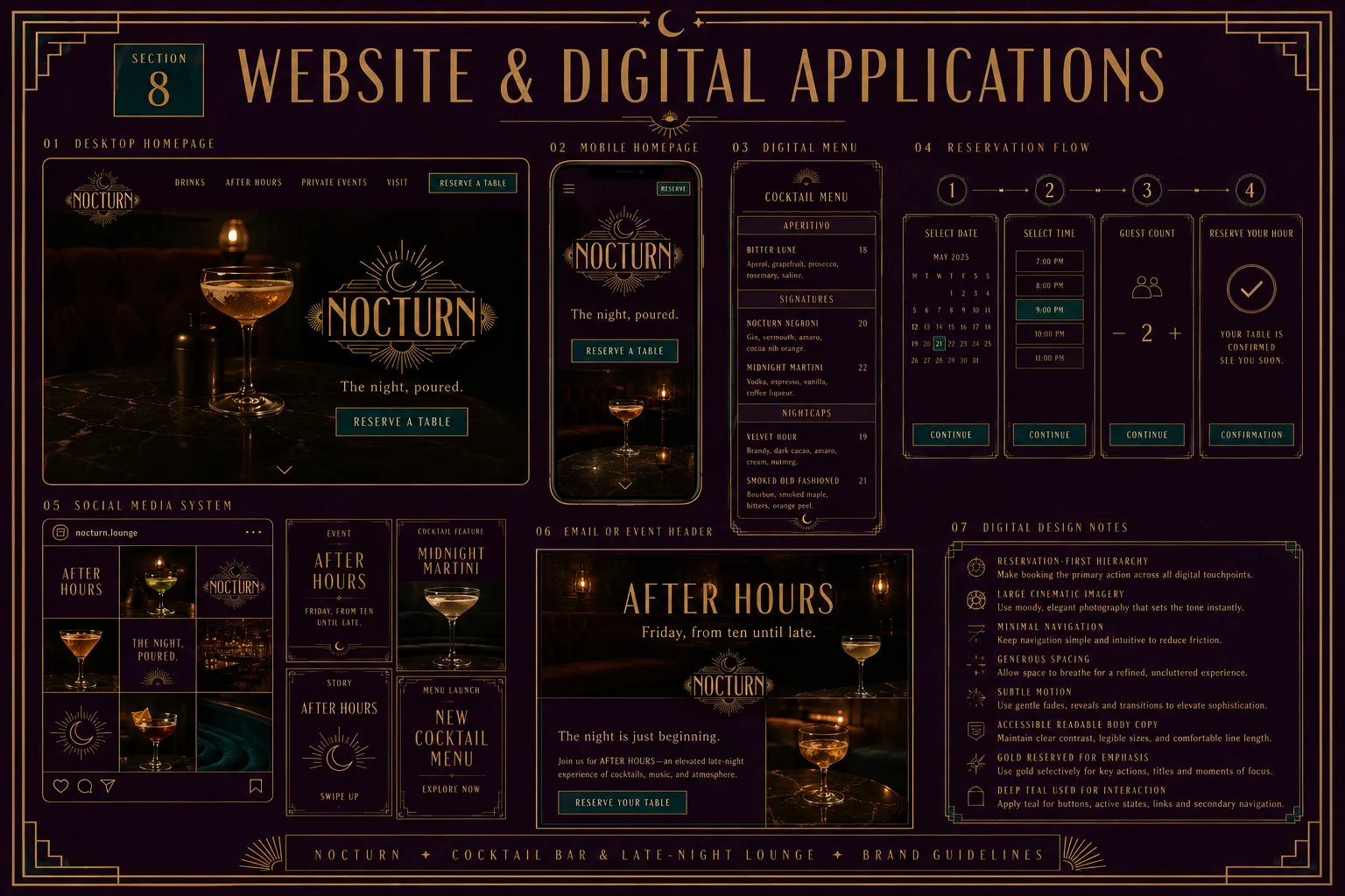
Nocturn website and digital applications — desktop and mobile homepage, digital menu and reservation flow
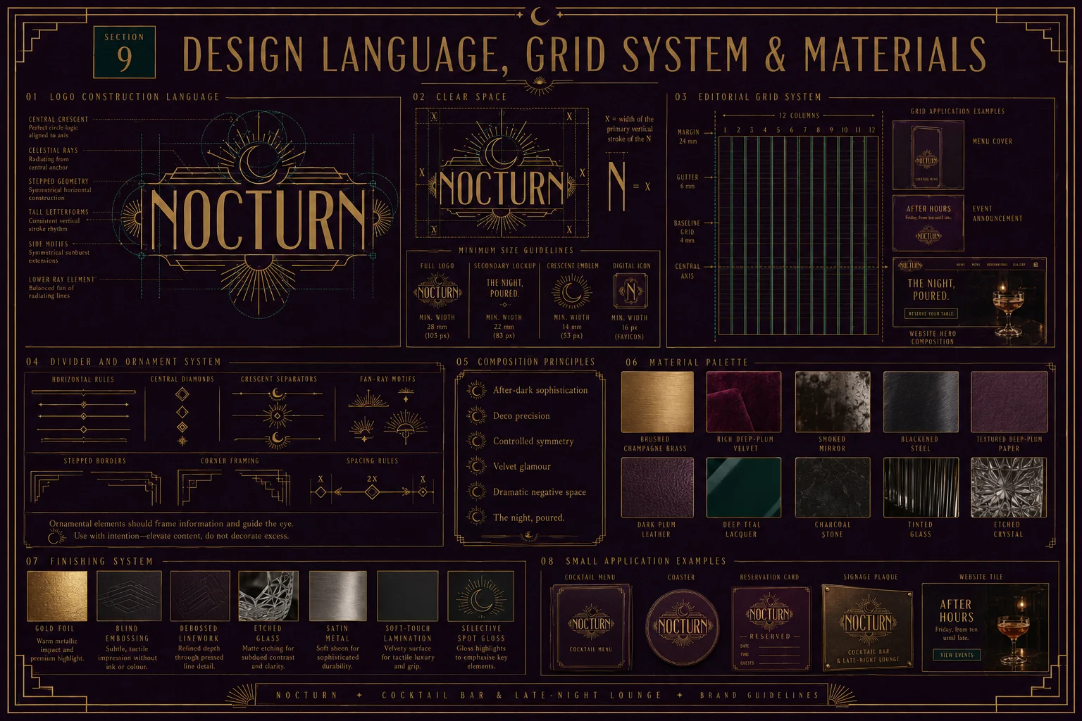
Nocturn design language — logo construction, clear space, grid system and material palette
06

The night, poured

The full system, in the room it was made for
Nocturn full brand system — bottles, cocktail menu, gift box, coasters and membership cards on velvet
07

The outcome

A complete identity system that turns an evening into a ritual — from the moment a guest sees the sign to the last card that lands on the table. Every touchpoint carries the same three colours, the same crescent, the same restraint. Nothing decorative. Everything deliberate.

Logo suite & submarks 5 marks
Colour & type system Full spec
Menus & stationery 17 items
Packaging & bottles 3 lines
Website & social Digital kit
Brand guidelines 9 sections
Next project

Lumen & Co.

View →
Close ✕