
Lumen & Co. — brass reading lamp lighting an open book and a coffee cup beside tall bookshelves
Brand identity · Packaging · Hospitality & retail · 2026

Lumen & Co.

Room to read.
Scroll
ClientLumen & Co.
SectorBookshop café
ScopeIdentity, packaging, print, digital
Year2026
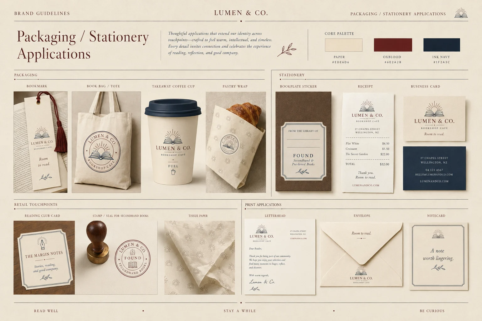
Lumen & Co. packaging and stationery — bookmark, tote, takeaway cup, pastry wrap, bookplate sticker, receipt, business cards and letterhead
01 — THE BRIEF

Two shops in one room

Most bookshop cafés let one half win: a café with shelves as props, or a bookshop with an apologetic espresso machine. Lumen & Co. is a neighbourhood third place where books, coffee and conversation carry equal weight — and the identity had to hold all three without pulling apart.

02 — THE IDEA

The light of ideas

A lumen is a unit of light. The mark sets a rising sun behind an open book — light coming up off the page, discovery arriving. & Co. does the other half of the work: the company you keep. Warm intellectual, never academic.

03 — THE SYSTEM

Built like a good book

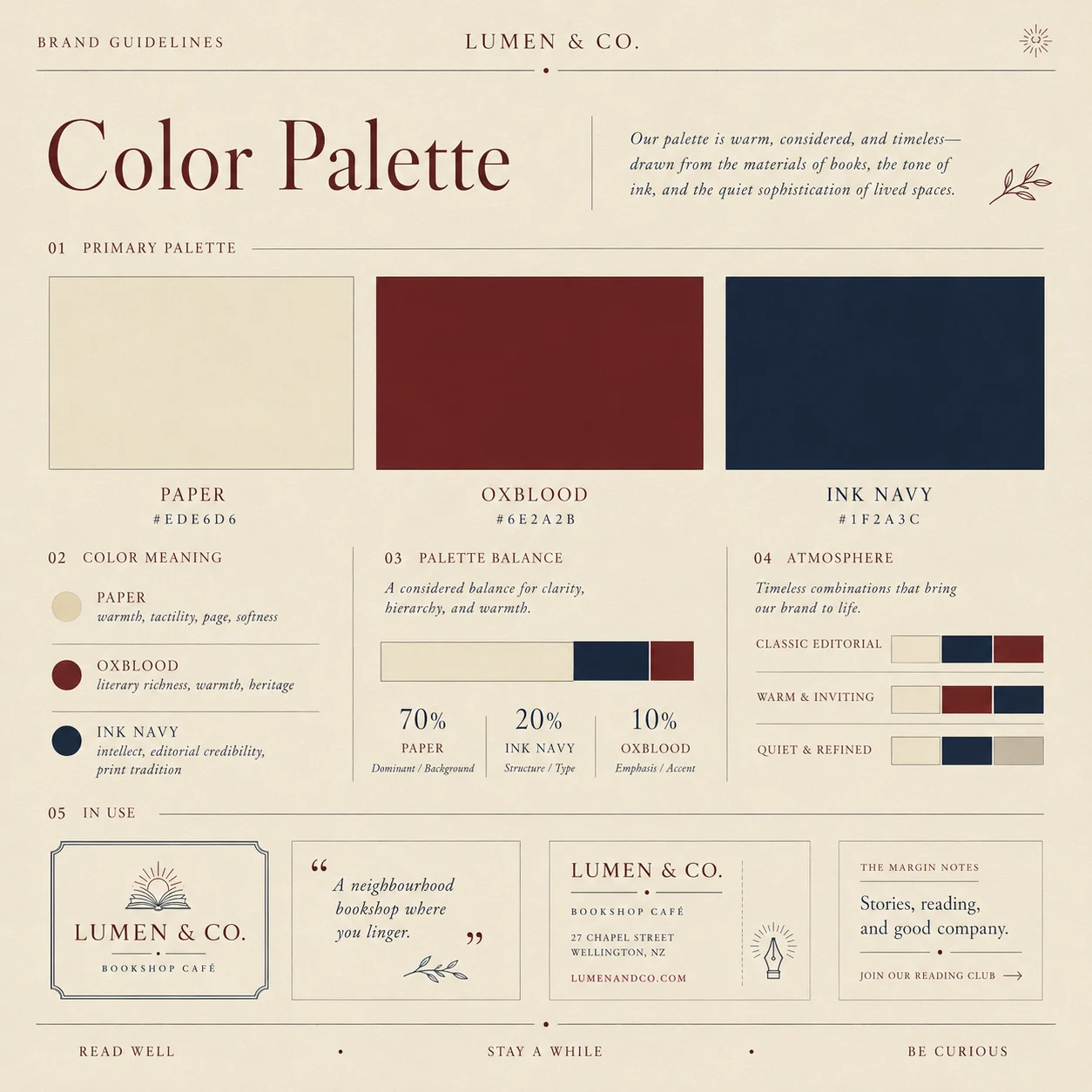
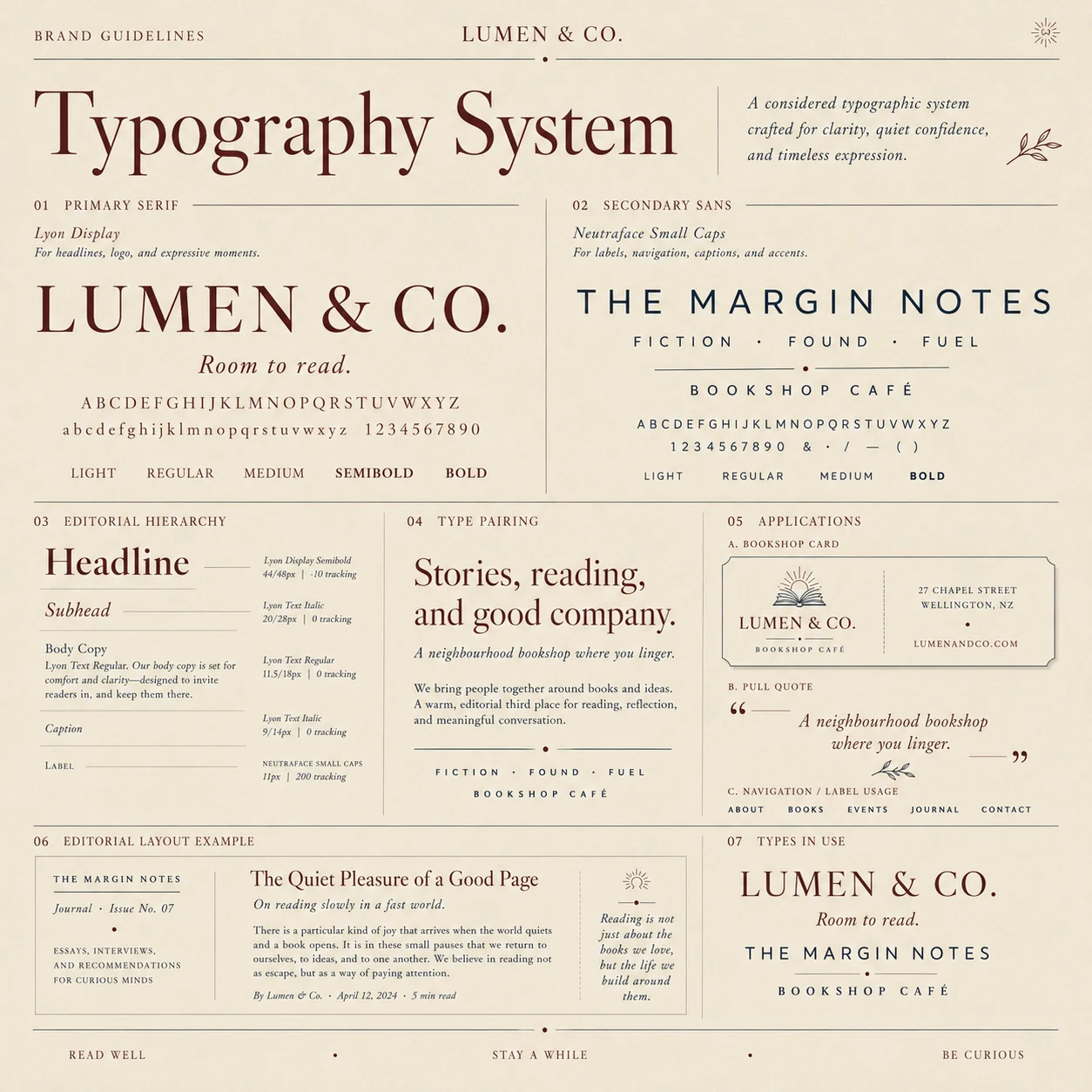
Paper, ink navy and oxblood, held at a strict 70/20/10. A literary serif carries the voice; small caps handle every label, shelf and sign. Rules, margins and quiet structure — the whole system behaves like a well-set page.
Stay a while.

Read well · Stay a while · Be curious
01

The mark

An open book, a rising sun, and the light of ideas
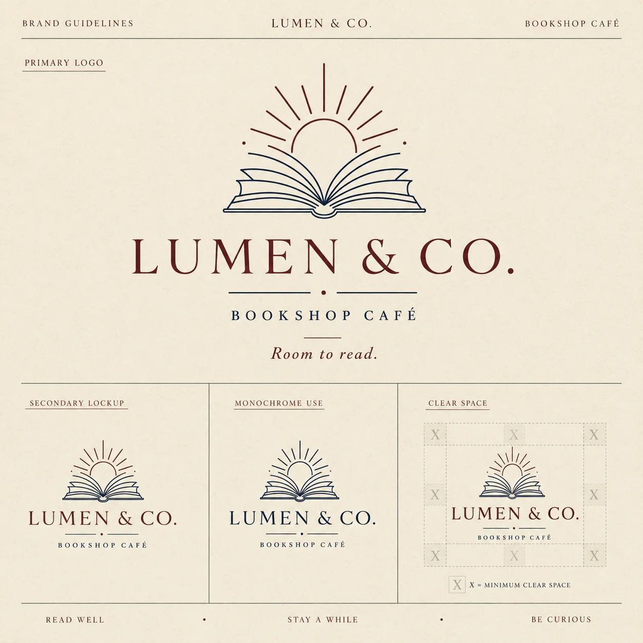
Lumen & Co. primary logo — open book with rising sun above a serif wordmark and Bookshop Café lockup
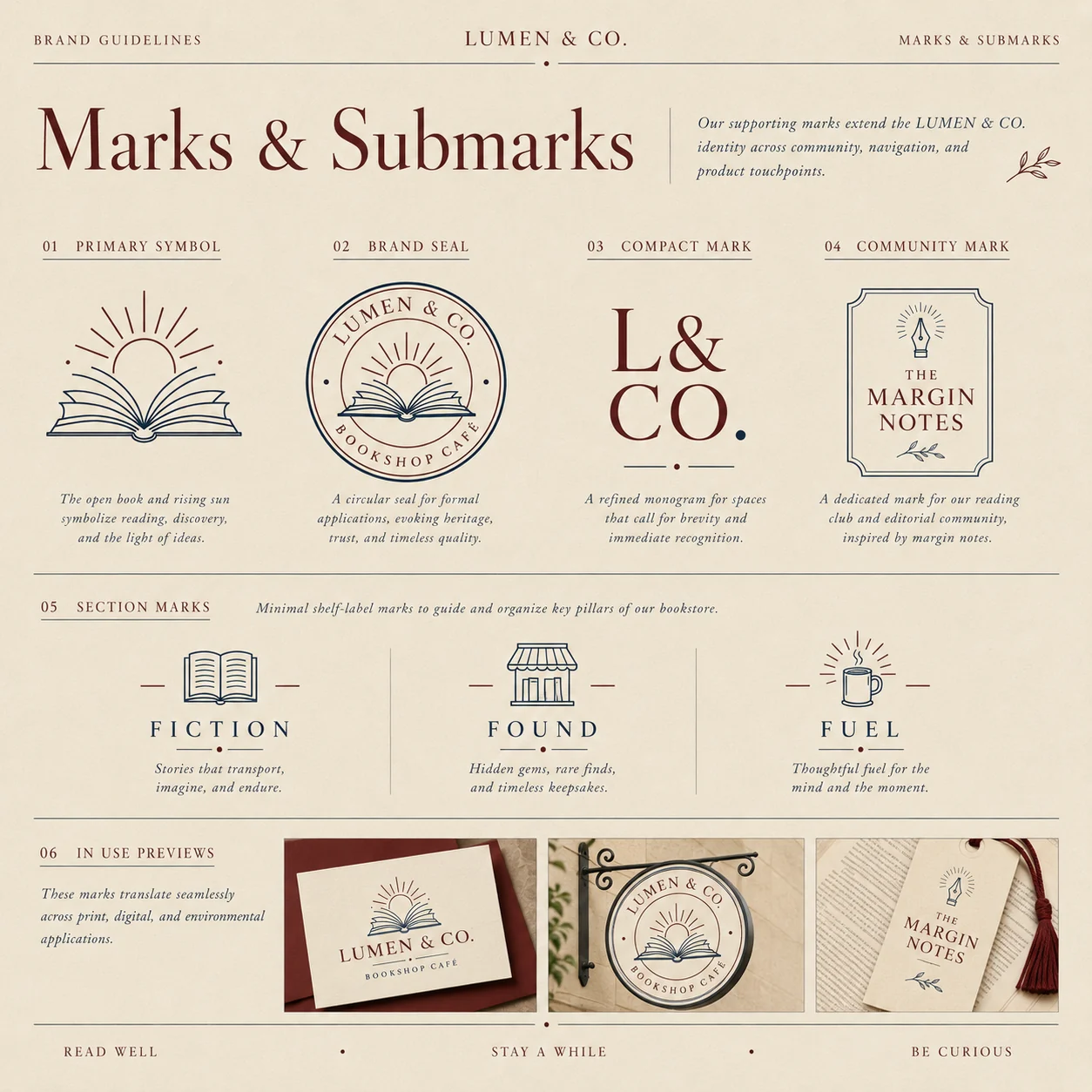
Lumen & Co. marks and submarks — primary symbol, circular brand seal, L&CO. monogram, The Margin Notes community mark and Fiction, Found and Fuel section marks
02

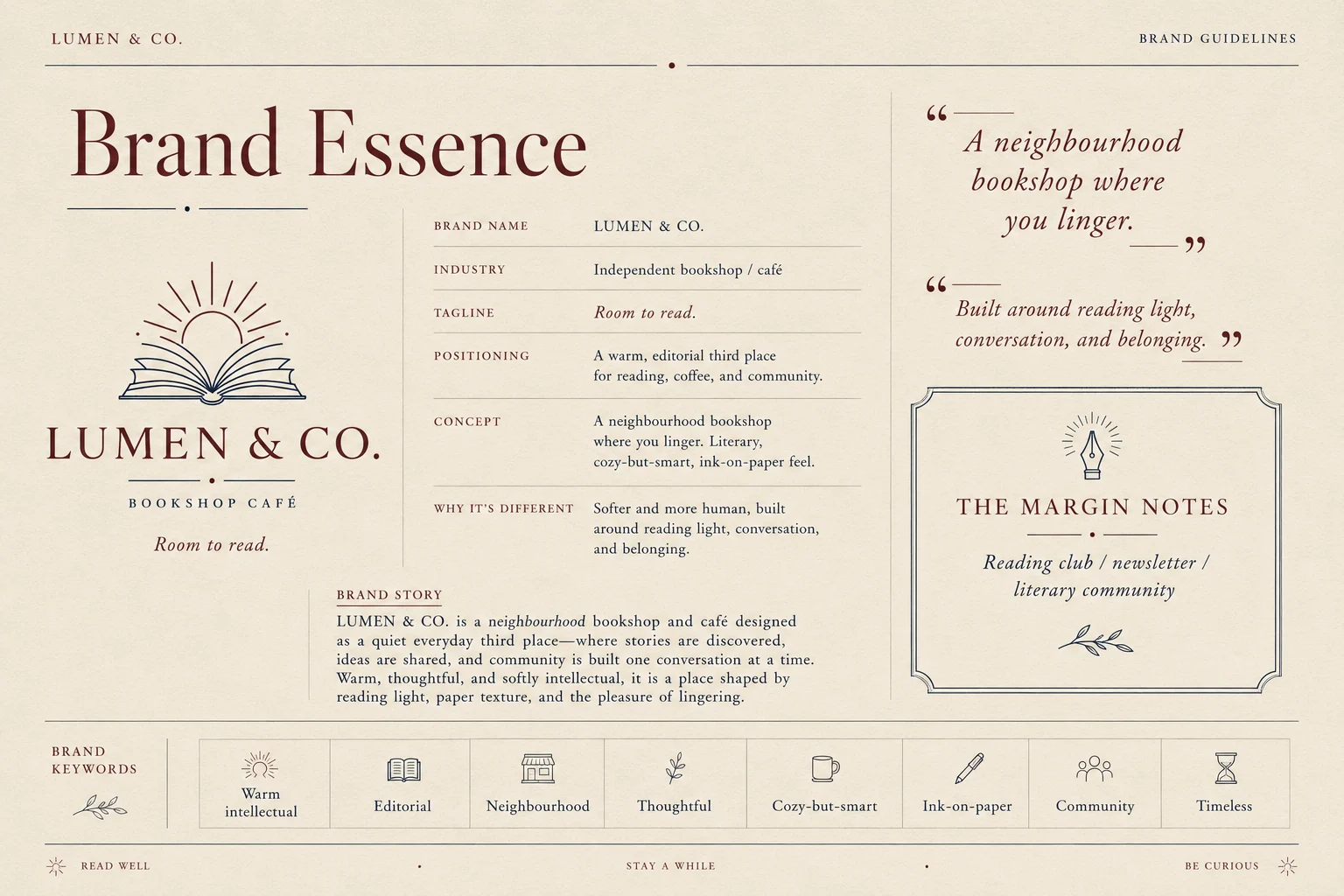
Brand essence

A neighbourhood bookshop where you linger
Lumen & Co. brand essence — positioning, concept, brand story and keywords for a warm editorial third place
03

Colour & type

Paper 70 · Ink navy 20 · Oxblood 10
Lumen & Co. colour palette — paper, oxblood and ink navy with a 70/20/10 balance
Lumen & Co. typography system — literary display serif with small-caps sans for labels and navigation
04

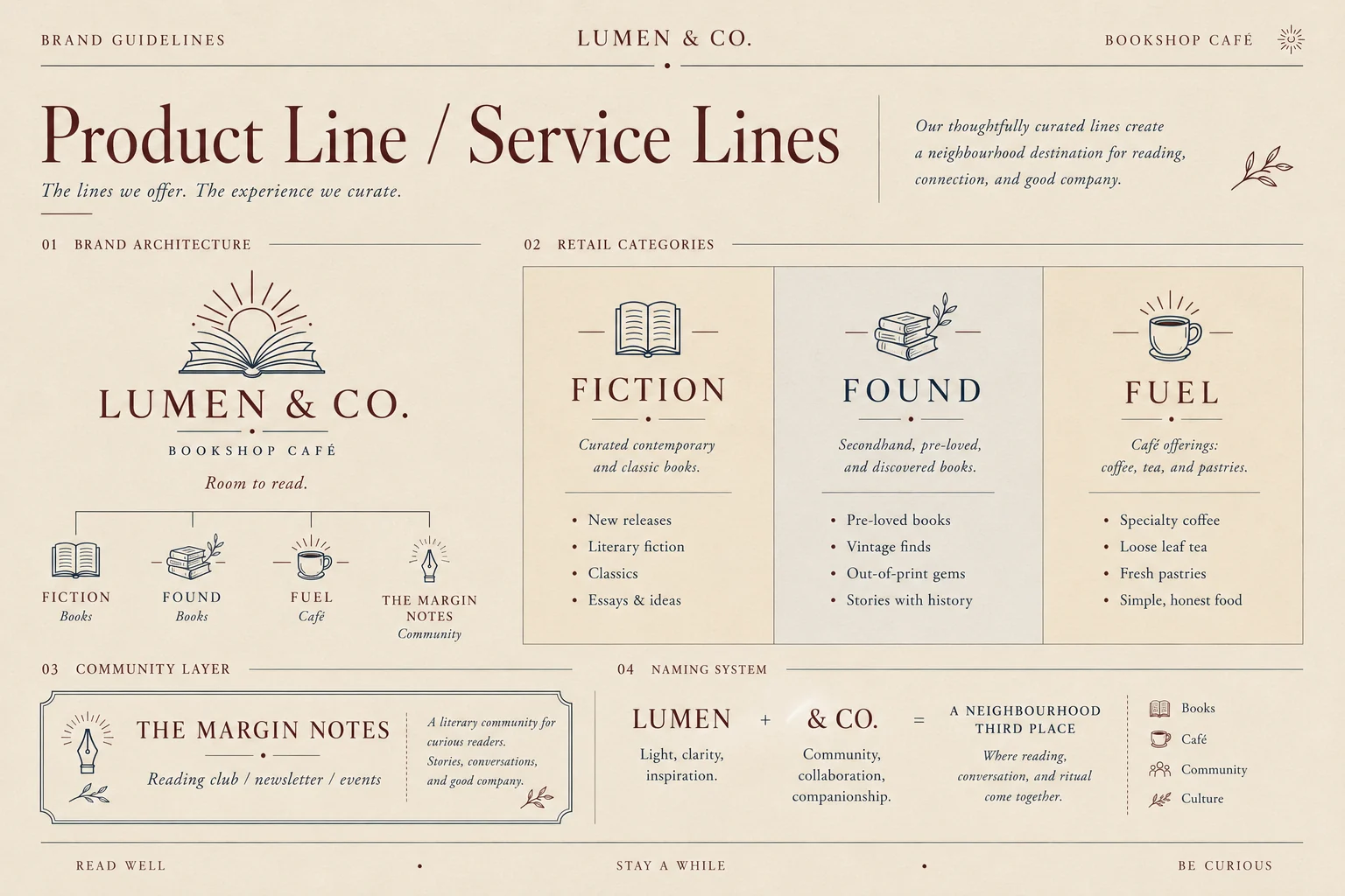
Three lines, one room

Books, books, and something to drink
FictionRead · Imagine · Endure

Curated new releases, literary fiction and classics — the shelves that set the tone.

FoundSecondhand · Pre-loved

Vintage finds and out-of-print gems, stamped and shelved as stories with a history.

FuelCoffee · Tea · Pastries

The café half — specialty coffee, loose leaf, and simple, honest food to linger over.

The Margin Notes Reading club · Newsletter · Events — the community layer, with a mark of its own.
05

Product & service lines

Brand architecture, retail categories, naming
Lumen & Co. product and service lines — brand architecture with Fiction, Found, Fuel and The Margin Notes community layer
06

Website & digital

Desktop, mobile, social and the reading-club signup
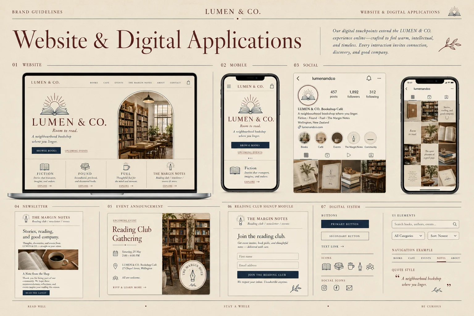
Lumen & Co. website and digital applications — desktop homepage, mobile site, Instagram profile, newsletter and reading club signup module
07

Design language

Construction, grid, pattern and materials
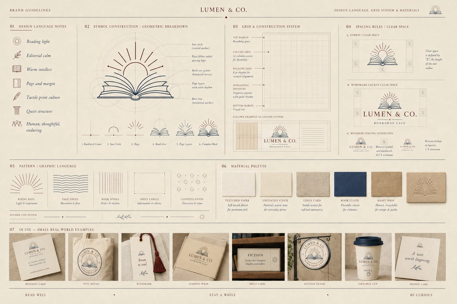
Lumen & Co. design language — symbol construction, 12-column grid, clear space rules, pattern library and material palette from textured paper to book cloth
08

The outcome

An identity that lets a bookshop and a café share one room without either one apologising. The section marks turn the shelves into wayfinding, the seal gives secondhand stock a story, and The Margin Notes gives the shop somewhere to keep its people between visits — a reading club, a newsletter, a reason to come back.

Logo, seal & submarks 5 marks
Colour & type system Full system
Section & shelf marks 3 lines
Packaging & stationery 12 items
Print & retail touchpoints Full kit
Website & digital UI Desktop + mobile
The Margin Notes Community brand
Next project

Pocket

View →
Close ✕